The following post is brought to you by Squarespace. Our partners are hand picked by the Design Milk team because they represent the best in design.
A brand is more than a logo, color palette, images, and typefaces. A brand is a feeling and a mood it’s your WHY. It’s the message you convey every time you post or speak about your business.
Graphic designer Steph Zangeneh Azam, of Mighty Within has some first-hand experience with branding or rather rebranding. She’s rebranded her own company eight times. So she knows a little something about transformation and the power that great design can have in articulating the meaning and message behind your brand. That’s why she uses Squarespace for her portfolio website—it allows her to beautifully display her brand while being flexible and easy to update. She believes that the most critical piece of getting it right is to understand your brand, what it stands for and what makes it unique.
Six Questions to Ask About Your Business Name
- Can I trademark the name?
- Is it unique?
- Does anyone else use the name?
- Can I get the url and the social media accounts?
- Where do I show up on Google searches?
- Does it really say what I want it to say?
Steph went through these questions with her own studio, and realized that not only was her current name (Wild Within) not unique, but it didn’t really get at the why behind her studio. Her real brand message was about tapping into POWER within. So after some soul searching, Steph changed the name to Mighty Within. And her answers to the questions changed.
- Can I trademark the name? Yes, in the process now.
- Is it unique? Yes.
- Does anyone else use the name? No.
- Can I get the url and social media accounts? Yes and I got the .com too!
- Where do I show up on Google searches? Yes! #2 on page 1!
- Does it really say what I want it to say? YES! Mighty is our strength and power within but it also encompasses the wild within too.
Getting at the why has been a game-changer for her personally, and so it’s a process that she shares with her clients. If a client is unclear about why their business exists and its mission, then it’s hard to design a logo that has any meaning. When there is clarity about the message, everything else falls into place.

Steph currently uses the Five template for her own site. When choosing a template for clients, she likes to mix it up. She’s used Bedford, Montauk, Hayden, Avenue, Pacific, Sonny, Native, Fairfield, Aviator, Bryant, Basil, Ishimoto, and Tremont.
The Tools
When it came time to translate that ‘why’ into an actual design, Steph turned to Squarespace. “I’m not a developer or programmer and found myself constantly frustrated trying to “Frankenstein” bits of code to build sites on other platforms,” Steph explained. “Squarespace changed all that with its user-friendly drop and drag system.” Once she learned the ins and outs of building a Squarespace site, Steph began offering website design as part of her branding package. “Squarespace has been an instrumental part of building my business.” Not only has the platform allowed Steph to expand her offerings to include website design, but it has also allowed her to showcase her own work in a cohesive way.
How important is a logo for a brand? For some people, it’s probably last on the to-do list.
There are different elements that make up a brand but the heart and soul of any business is the WHY and the logo. The logo is the “face” of a business and it can either repel or attract ideal clients and customers. So it’s important to have a well-designed logo that connects people to the brand because it says “we put time and care into what we do/make/sell/offer.” It builds trust and recognition.
When it comes to designing a logo for your brand, what are some considerations that everyone should think through?
Less is more.
— Ludwig Mies van der Rohe
Keep it simple and make it memorable! A long name, wordy tagline, trendy fonts, and detailed graphics can overcomplicate a design. Think about the different ways in which the logo will be applied since that will affect the font choice and color. Logos need to be legible across all platforms and applications when scaling up and down. Every design decision should have a reason and be connected to the “why” of the business.
Can you talk about using symbols or illustrations as well as only text?
I like developing logos that incorporate symbols and/or illustrations along with text. They add a unique personality and connection to the brand. But sometimes, the right symbol or illustration takes time to uncover.
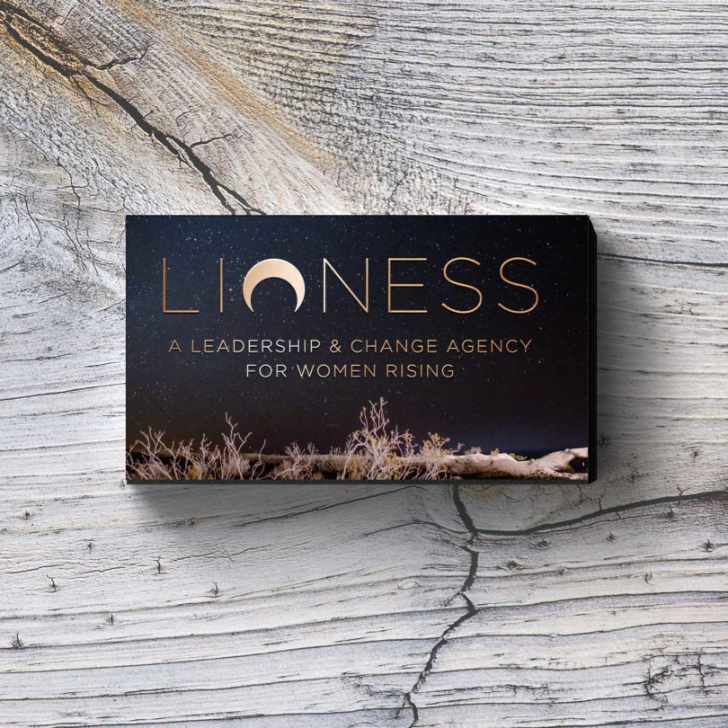
When I designed the logo for LIONESS I was stuck on the idea of using a lioness as the symbol. Revision after revision it just wasn’t working. It was too literal and it didn’t depict the essence of the brand: a leadership & change agency for women rising.
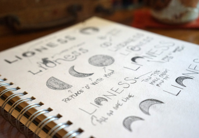
My client wanted a powerful (yet feminine) symbol and had mentioned in the beginning that she felt connected to the crescent moon. So I revisited that idea and pulled out the original moon sketches I’d never shown her. I had replaced the “O” in LIONESS with the crescent moon and flipped it upside down to represent women rising.
After looking at it again I realized how powerful it was and how truly connected it was to her brand. So I ended up showing her and all she said was THAT’S IT!
Can you tell us about your design process?
I’m a creative who needs a lot of “think time” so I don’t immediately sketch or jump on the computer. For me, the most important part of designing a logo is understanding the business. So I dive deep into the branding questionnaire and ask questions. I want to know the essence of a business and what makes it unique.
I research what competitors are doing and see what elements work and what I want to avoid. Let’s say I’m working with a yoga studio and 85% of other yoga studios I research are using a lotus flower. Then that would be something I’d try to avoid in my designs.
Once I’m ready to design I’ll either sketch ideas in a notebook or jump straight into illustrator. Sometimes I know exactly what I want to design and other times I need to play by mixing and matching elements. Once I have 3 or 4 strong concepts I’ll refine them further and then present them to the client.
How important is scale when designing a logo and how do you play with that?
Scale helps me when I’m stuck on a concept that isn’t working. I can blow the elements up large or make them tiny which changes the mood or feeling and gives me a new perspective to work from.
When I designed the logo for SACHA I didn’t want the triangles to overpower the text and vice versa. I wanted SACHA to be the focal point yet feel balanced within the triangles and other text. So I played a lot with the size of the triangles and the kerning of the letters to find that happy balance.
How do you test a logo?
I look at how it translates horizontally and vertically, in color, black and white, grayscale, and reverse? I’ll print out different sizes ensuring it scales up and down with clarity. I make sure it’s legible when overlaying images and textures on different screens and in different applications.
Ready to get to work on that branding? Take the first step with a Squarespace website. Use coupon code DESIGNMILK at checkout to get 10% off your first purchase.
from WordPress https://connorrenwickblog.wordpress.com/2018/03/27/ask-yourself-these-six-questions-branding-with-steph-zangeneh-azam-squarespace/




No comments:
Post a Comment