The internet has undoubtedly made the world a smaller place, erasing distances, and assisting collaborative efforts between parties across the globe. Even so, industries with international reach like design, fashion, and technology still rely upon trade shows to allow designers, manufacturers, buyers, and even occasionally the public to congregate under one roof for valuable hands-on, in-person interactions to learn what’s on the horizon.
After attending MIDO – the world’s largest international eyewear show hosted each year in Milan, Italy – for three years in a row, we recognized an ideal opportunity to investigate the behind-the-scenes logistics, planning, and design of a trade show attended by over 1,300 exhibitors and 58,000 attendees from around the world. Though much is reported about what is on display at trade shows, rarely are the details of trade shows themselves revealed. We spoke with both Giovanni Vitaloni, the newly appointed President of MIDO, and Francesco Pagliariccio, MIDO Production Designer, about the efforts required to orchestrate the world’s most important eyewear event.
MIDO seems to operate both as the locus of the eyewear industry and also a festive occasion. After three years attending, this year’s show seems the biggest and bet yet. Could you tell us how the layout and exhibition design of MIDO serves both purposes?
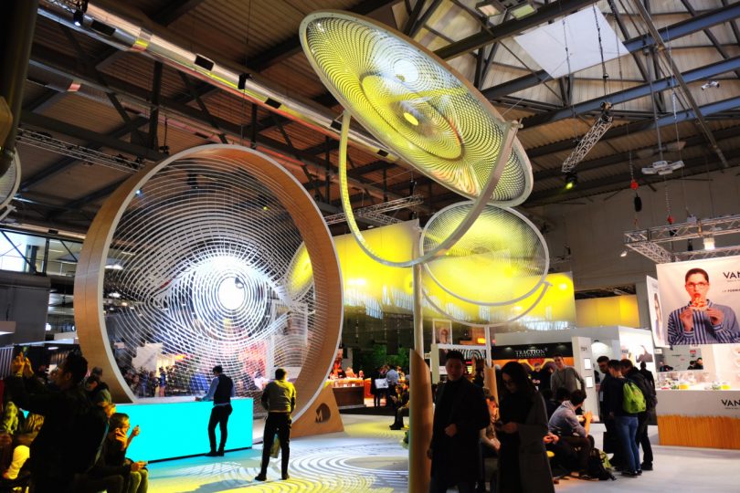
Giovanni Vitaloni, President of MIDO: In the last 4 years MIDO has made outstanding improvements in the design and construction of common areas, creating a stage-like setting for the entire exhibition grounds. Squares, corridors, lounges, and service areas are designed to impress visitors and exhibitors, and to maximize their experiences and interactions at the show.
Experiences and emotions: these are two crucial elements that only a physical presence can provide. This approach has obviously had effects on how exhibitors organize their participation at the show and their booths have become more in tune with the general atmosphere.
It is true, though, that the “piazzas” like the Fashion District Square are meant to remind exhibitors that the trade show is a meeting place…an event where you welcome customers and partners, and where you might meet new ones. So we hoped this concept would support the construction of open booths instead of closed boxes, like the ones you see in many shows dedicated to other industries.
And it seems the open theme worked. Exhibitors gradually began to redesign their booths and their communication strategies in order to be more open to interaction, and to stand out in this compelling and highly competitive context. The result is a general and significant improvement of the quality of the booths, as you noticed.
Who is responsible for designing the exhibitions of MIDO?
Francesco Pagliariccio, MIDO Production Designer: My design team is comprised of five people who work with me in the creation of the concept and its single elements. The construction and the set-up require four teams of eight people who work in the various halls and take turns in the different areas according to their expertise and to the contingent needs.
The specificity of the industry could make retreading/rehashing previous years a challenge. How does your team make each year a unique experience for exhibitors and attendees?
Francesco Pagliariccio, MIDO Production Designer: The MIDO team is always offering feedback and providing valuable suggestions. The main theme always relates to vision and related concepts: eye, eyesight, visual perception. But every year we try to reinterpret these themes through different constructions, based on minimal shapes and designs to convey this meaning and a particular context.
The challenge is finding new ways of expressing the same basic theme, while at the same time keeping the level of attention high. We usually do that by applying a modern take on simple shapes and combining them with advanced technology/materials to incorporate interactivity and engagement.
Could you tell us how your team conceptualizes and models the MIDO show floor before construction?
Francesco Pagliariccio, MIDO Production Designer: We mainly use 3D software because it allows us to better assess the impact of the themed area in relation to the rest of the halls. As exhibitors’ booths are being allocated, we need to continuously adjust the design according to the surrounding context; 3D rendering is the best technique in terms of flexibility and visualization effects. But we always begin with a simple drawing before moving onto work on computers.

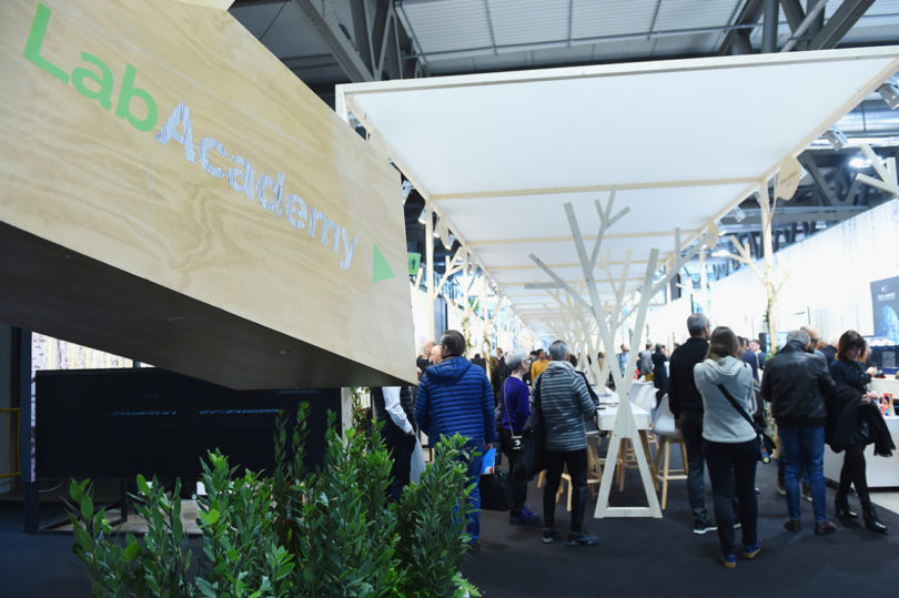
The newly redesigned Lab Academy allowed exhibitors and attendees ample space to greet and meet in the middle between displays.
The section dedicated to cutting edge eyewear exhibitors – Lab Academy – was brighter and more open this year. Was this change due to feedback or a simply a refresh decision?
Giovanni Vitaloni, President of MIDO: The Lab Academy’s exhibitors actually loved the previous layout and were not sure about changing it. They liked the industrial-building look and the general atmosphere; they were afraid a radical change might undermine the identity of the area. Therefore, what we did was a real leap of faith. But we strongly believed the area needed a change and that a total restyling could improve the visitor and exhibitor experience within this area.
And the new woodland theme?
The woodland theme was inspired by the themes of tranquility and interior peace, crucial elements when you need to find inspiration and to create. We imagined a natural haven where the boldest eyewear creators could find serenity and experience detachment from the frantic chaos of a trade show in order to meet their customers in a relaxed environment. The actual space is roughly the same size of the previous years. But you are right: bright lights and bright colors made the difference in perception, so that it kind of felt bigger and more open that the previous layout.
What effort does MIDO take to optimize colors and materials on display. Or is this purely the responsibility of each exhibitor?
Francesco Pagliariccio, MIDO Production Designer: Each exhibitor is responsible for the lighting of his/her booth, we only design lights for the common areas and in doing that we must be aware that our creations are subject to constraints. We cannot create areas that are too dark or devise shadowy light effects that undermine the exhibitors lighting, we must always bear in mind that our creations are at the service of the exhibitors goals.
Now MIDO 2018 is wrapped up, have you already begun designing/planning for next year’s show?
Giovanni Vitaloni, President of MIDO: Yes! We are always thinking about the next MIDO. Although we do not believe it necessary to completely redesign the show every year, we will do something more significant every 2 or 3 years, with smaller updates in between. But every year we are working toward offering visitors and exhibitors an experience that lives up to our tagline and hashtag: “live the wonder”.
from WordPress https://connorrenwickblog.wordpress.com/2018/05/16/designing-an-experience-behind-the-scenes-at-mido-2018/


No comments:
Post a Comment