The following post is brought to you by YLighting. Our partners are hand-picked by the Design Milk team because they represent the best in design.
Whether hanging above a dining table, in a stairwell or even in a closet, the chandelier is a showstopper. And arriving at this designed object took the help of nearly all of Europe. The proto-chandelier was a metal, circular holder for oil cups in mosques during the Middle Ages. Crusaders in the Middle East took the idea home and created hanging candelabras for their cathedrals. Belgian brass artisans in the 11th century gave them the shape we recognize, and Italian gem cutters added faceted smoky-gray crystals. Finally, a new, clear lead glass made in London gave us the stunning crystals objects that hang in the Palace of Versailles. And designers are still fascinated with redesigning and reinterpreting the chandelier.
So it’s fitting that for YLighting’s International Design Event (which gives you up to 20% on select designs from around the globe through 6/11), we take note from the most international of lighting object: the chandelier. Here are some of our favorite chandeliers from around the world (and design lessons gleaned from them).
GREAT BRITAIN
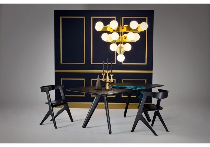
The Plane Chandelier is an exercise in that very British of characteristics: restraint paired with slightly off-beat humor. It was designed by self-taught London-based industrial designer, Tom Dixon. Note the way that the globes balance, ever so precariously, on the edge of the triangle. It’s just the right amount of quirky eccentricity. (This is, after all, the designer who created a bronzed shoe as a doorstop.) Take a page from the Dixon book of irreverence and maybe play with your lightbulb color. For example, while white light is task lighting appropriate, there is nothing like a softening pink light bulb to up the romance (and make you look rosy, in the process). Worth a try? 
SPAIN
The Rhythm chandelier was designed by Israeli Arik Levy for the Spanish brand Vibia and was inspired by Zen minimalism. The fixture is completely flexible (like a Zen mind) and is able to be positioned in countless ways. Plus each module can rotate on its axis and then be locked into place. That sort of flexibility is a design ideal that works for nearly every situation. Whether it’s a chandelier that can cast light on different angles of the room or a swing arm lamp that can light the table and sofa (we love this one). Adaptable design is a pretty great thing.
ITALY
The inspiration for the Caboche Chandelier was a 1930s plastic bracelet – the very thing you might imagine a young Sophia Loren sliding on her wrist as she headed out for a night on the Riviera. Designed by iconic Spanish designer Patricia Urquiola with Italian designer Eliana Gerotto for the Italian lighting powerhouse Forscarini, this fixture is the epitome of glamour, and is a good reminder of just how fun a little touch of plastic can be. From an over-the-top chandelier to a plastic bar cart or even tray, it’s a playful spin on luxe.
The NETHERLANDS
A brand that takes its name from the Dutch word for beautiful, Moooi, (pronounced “moy”) should know a thing or two about hitting aesthetic home runs. The company has been at the center of Dutch design since the 1990s. The Coppelia Chandelier is a recent collaboration with Japanese designer Arihiro Miyake, who wanted to reimagine of the traditional chandelier. The stainless-steel frame supports 54-LED lights housed in polycarbonate tubes (reminiscent of wax taper candles). It looks sculptural in the day, and then at night, the frame visually disappears and the lights appear to be free-floating. Designing for both day and night can be key to creating a space with depth. With their avant garde take on Dutch design, Moooi teaches us to not take things too seriously—elegant and beautiful can still be fun.
The New Zealander
Although technically a pendant (one bulb = pendant), the Coral-inspired fixture from David Trubridge Design was just too striking not to include. Before settling down as a designer in New Zealand, David sold his belongings and took his family on a sailing trip around the world. The coral chandelier is reminiscent of that sea voyage. As an acknowledgement of the importance of the natural environment, his designs are constructed from sustainable wood, nontoxic oils and recyclable plastics. Design with a conscience.
If all this talk about chandeliers, makes you rethink your lighting, that might be a good thing. There is nothing quite as important. If you’ve ever been at a bar when the lights come on at closing time, you know how quickly bad lighting can kill even the most romantic of moods. There is perhaps no other element of decor that can change the mood of a space quite like lighting. And the king of all lighting, is most certainly the chandelier.
Shop all chandeliers and take advantage of International Design Event savings at ylighting.com.
from WordPress https://connorrenwickblog.wordpress.com/2018/06/04/going-global-design-lessons-from-the-chandelier/


No comments:
Post a Comment