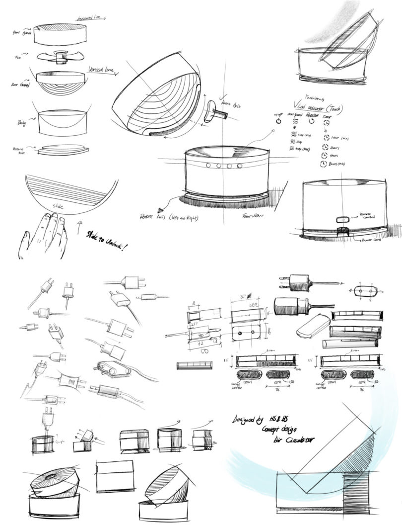
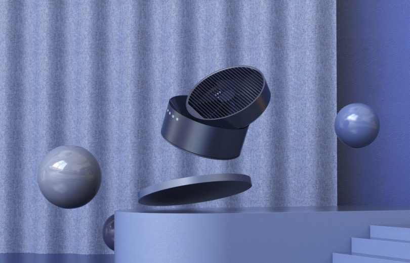
“Slide to unlock” – It’s a command now practically synonymous with our interactions with smartphones. But what if you applied the same user interface to access something entirely different without a screen interface? That’s exactly what Korean designers Hooseong Lee and Beomsic Jeon have explored with Slide, a design concept that blows away preconceived notions of what a fan should look like and how it operates.
Slide a finger across a screen, and access to your phone is granted. Swipe up on the front surface of the Slide, and the bowl-shaped air circulator slides upward from a previously hidden horizontal position to a range of angled positions, offering an upward and outward directional flow. Though Dyson fans have long tilted with a similar sliding design, the Slide offers a clever divergence from nearly every other household tabletop or floor fan by abandoning the verticality required to move air from one end of the room to the other. It’s ace card is its capability to hide its purpose (and the eyesore of a traditional fan) in plain sight.

Because the foundation of the household electronic appliance design is touch, Lee and Jeon also decided to forgo a slick, smooth surface for one with a slightly textured feel. Following the concept of “only visible when required”, other features are hidden from view: a front touch interface controlling fan speed and timer illuminates across the front base only while turned on; a wrap-around cord storage feature is hidden underneath, keeping the minimalist design appropriately tidy; a small four button remote control slides into the base for charging and storage. Even the two-prong power plug is designed to slide from sight.
The sum of the Slide’s thoughtful features make for a tantalizing argument that the average fan can be designed beautifully to integrate within the home, whether on or or off.
from WordPress https://connorrenwickblog.wordpress.com/2018/07/23/slide-borrows-from-smartphone-ui-to-keep-things-cool-and-minimal/


No comments:
Post a Comment