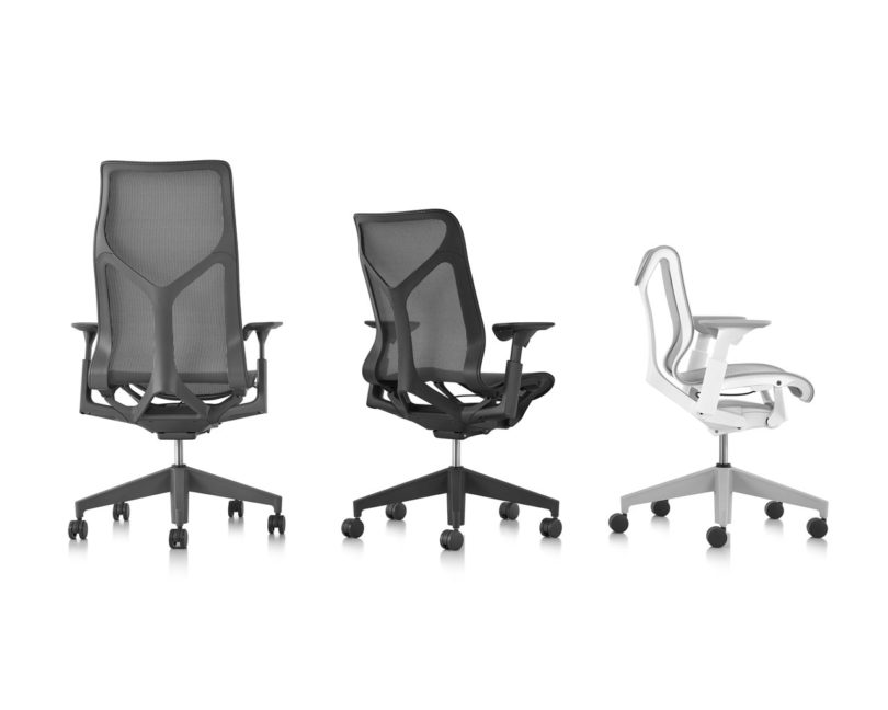
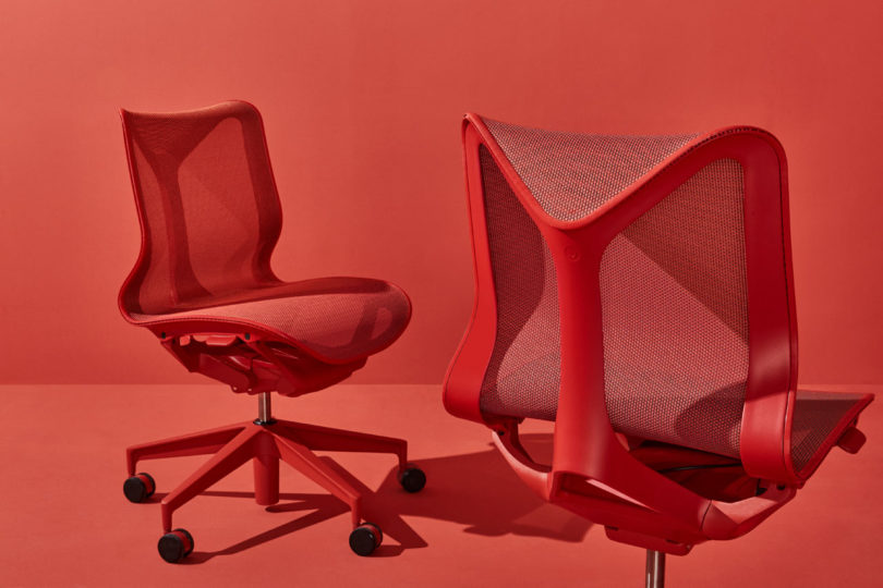
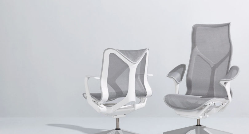
Herman Miller has had endless notoriety and success with their Aeron Chair that was designed by Don Chadwick and Bill Stumpf back in 1994. Now, almost 25 years later, it seems they’ve struck gold again with their new Cosm Chair designed by Berlin-based design firm Studio 7.5. The designers spent eight years researching and developing the chair’s Auto-Harmonic Tilt system which offers the user a self-adapting work seat for maximum comfort, which seems necessary if you think about how many hours we spend at our desk. If you’ve tested it out, you know. If you haven’t, run to your nearest store to take it for a test run because it could very well change your work game. If you want to learn more about it and how it came about, Studio 7.5’s Carola Zwick is graciously giving us an inside look into the design process now, in this month’s Deconstruction.
We didn’t want to make a chair again. Our idea was more to think about an experience, an experience of zero gravity. So the code name of the project was Flying Carpet. The idea was to be suspended, so you can fully focus and “forget gravity.” We also wanted to provide all of our knowledge about ergonomics and comfort, not in a mechanistic way, but in a way that is very down-played and comes without a visual burden, so to speak. Our desire was to incorporate as much as possible in a way that is tacit. You feel it, but you don’t have to actively look for it.
The first Cosm prototype was built by Roland to prove out a hunch. He wanted to experience a continuous suspension – as we used in Setu – with the torsional flex and full tilt range provided by Mirra. As a team, our motto is “Demo or die.” If someone builds something and it feels great, it is a compelling argument for going down that path. This first prototype made a very strong argument, and so the eight year journey began.
Cosm was about designing an experience, and therefore we first needed to have the experience. As a result, some of our first prototypes look pretty frightening or ugly. But it is about just trying it and sensing how it feels.
From the first sittable prototypes, the next step was to translate the functional understanding into the form that would deliver the experience. We created design models to explore and communicate the visuals, and to bring to life the essence of what we knew would follow.
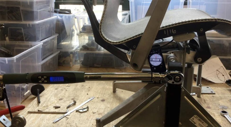
We next started to dig into the details. We want every part to look refined, even without the context of the whole chair. For example, what should the joints be like – what do we actually want from this object? There are all these interfaces that have to work together and be reliable over time.
It became apparent we needed to develop new prototyping methods to test our hypotheses. One of those methods was to find a better way to attach the soft suspension fabric to the chair frame. Trying to find methods to cast a resin edge to the fabric – well, a lot of things went wrong. We finally found an approach with syringes and polyurethane. In order to get the full membrane molded, it took eight people as we only had 120 seconds before the material cured. This experimentation eventually led to a new way to attach the fabric to the frame in production.
We also started a parallel exploration by asking another question. We had this method of designing comfort into a chair using suspension material. Could we translate that experience to the arm? Of course the first versions that felt good didn’t look good…
We then started to refine the shape. The shape looks so funny because the frame needs to avoid your funny bone. We had to find a way to eliminate contact between the body and the frame. There were a lot of iterations for both structural rigidity and the form. The essential idea was that if you sit at a table, this cradle for your elbow is supporting your arm but not preventing you from getting close to the work surface. But it had to be sturdy enough to support people using the arms as “handles” for getting in and out of the chair.
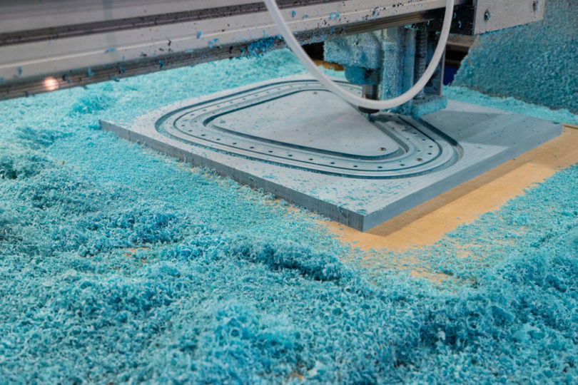
The journey of the self-adjusting tilt was even longer – over eighteen years. Our goal was to combine the path of motion on the Mirra chair but without adjusting anything. Many design and testing iterations were completed for each of the tilt parts, utilizing 3D printing extensively. We learned a lot by assembling things wrong, which informed changes to help manufacturing.
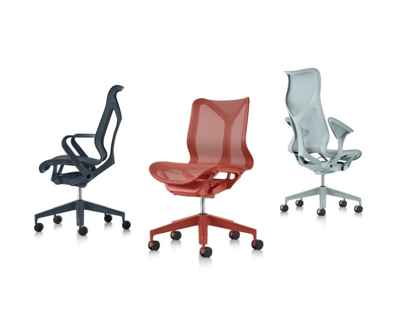
Lastly, we dreamed about a lot of color for Cosm. The influence of residential patterns both in behavior and in aesthetic preferences were drivers for this aspiration. Cosm tries to overcome the traditional office color and material scheme of chrome and black, but in a more sophisticated way. By dipping the whole object into one color it’s in a way de-materialized and at the same time “iconized.”
Even if you produce at an industrial scale, there is still craftsmanship involved. Hopefully we were able to follow the Eames’ footsteps in designing something that is careful in every detail. All of these details have a reason why they are the way they are. It was a long journey, but the gap between our ambition and the final implementation is smaller than any project we’ve done before. We hope you are able to come try out the result.
The Cosm Chair has officially launched and is available for purchase in three versions and in five colors here.
from WordPress https://connorrenwickblog.wordpress.com/2018/09/25/see-how-herman-millers-brand-new-cosm-chair-came-to-life/






No comments:
Post a Comment