Stacey Sheppard is a UK-based freelance writer and author of the popular award-winning blog The Design Sheppard. She specializes in writing about interior design. She has a particular penchant for kitchen and bathroom design but also has a keen interest in surfacing and materials. When she’s not working she can be found manically pinning inspiration for her own home renovation project. You can follow Stacey on Twitter @StaceyJSheppard and Instagram @StaceyJSheppard.
One of the most hotly anticipated exhibits at Imm Cologne, the international furniture and interiors fair that took place in Germany last month, was Das Haus. This annual installation, now in its eighth edition, is a simulated residential house measuring approximately 180 m². Each year, the architecture, room structures, furnishings, materials, colors and light installations are all reimagined by a newly nominated designer, design team or architect. This artistic concept allows the designer to create their personal vision of an ideal residential situation and visitors to the show are able to test it out and experience it.
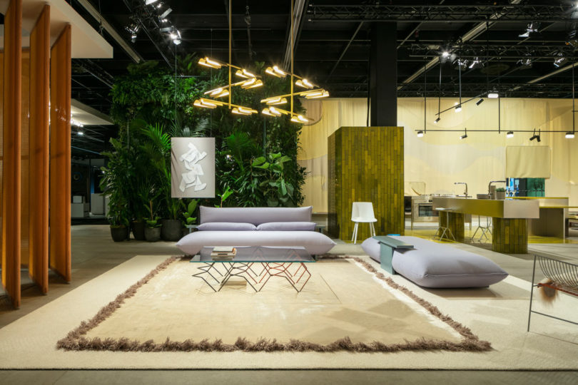
For 2019, the Australian design duo Kate and Joel Booy of Rotterdam-based Studio Truly Truly presented “Das Haus – Living by Moods”, an elegant, airy design, which sought a new approach to open domestic culture.
The installation had an air of mystery about it as the stand was shrouded in curtains of fabric in a camouflage-like pattern. Once inside, the visionary space offered a new way of living where the emotive spaces challenged the conventional ideas that we have about how our home life plays out.
In this new way of living, it’s not the functions that characterized the rooms, but rather their atmosphere. Instead of having a living room, a dining room, an office etc, there were instead four distinct zones: Reclusive, Serene, Active and Reclining. The rooms signified freedom rather than fixed delineation as they merged into one another and their function was hinted at rather than dictated by the furniture.
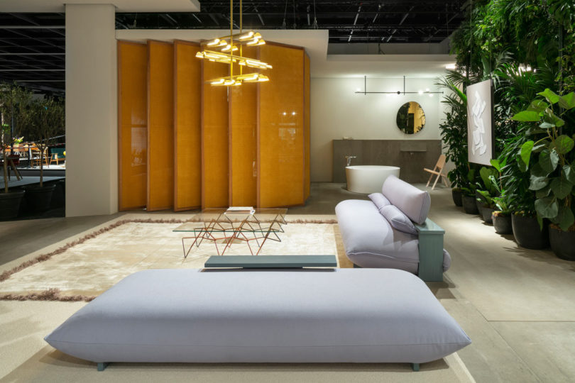
Private areas alternated with public ones, but they were not separated by walls. Where necessary, the open spaces were divided by strategically placed room dividers. Only the bedroom appeared to be slightly set apart by the use of pivoting room dividers that acted as louvres and allowed the bedroom to be completely closed for privacy or opened up to become part of the living area. In this way, exciting viewing angles were opened up throughout the whole space.
The expansive open space did include private areas and quiet zones, which featured a variety of seating options, some of which were solitary and some grouped together. This gave the space a greater sense of flexibility. Each part of the home created a certain mood so that those who lived there were able to find a perfect place for the activities they were looking to engage in, in accordance with their mood and the rhythm of their lives.
The contemporary home imagined by Kate and Joel Booy had a natural, organic flow. Living, working, sleeping and relaxing could take place in numerous locations within the space. Nothing was explicitly coded and there was plenty of room for interpreting the various ways in which a space can be used.
Even the furnishings were multi-functional. The large dining table could be used for various activities besides eating, as it could easily double up as an office space or homework station. The sofa didn’t dictate any particular seating orientation, and the kitchen sink area could also serve as somewhere to share a coffee.
In fact, the kitchen remained the center of the home where people come together. For Das Haus, it was constructed from polished stainless steel and golden hued tiles. The layout of the kitchen was quite unconventional though and rather than including a fitted kitchen, Studio Truly Truly threw out the kitchen design rule book and created a space that invites you to reorganize your workflow.
The areas for washing, preparation, cooking and serving were all quite separate. The refrigerator and cupboards disappeared into a wall unit. A bench forming several seating levels led across into a quiet corner, and the sink unit also protruded far into the room.
One thing that became abundantly clear from visiting Das Haus in person is that it was designed as the antithesis to our fast-paced modern lifestyles. Studio Truly Truly designed it to be a space that allows you to escape from the rapid tempo of life and where you can shift into a lower gear. And we all need that, don’t we?
from WordPress https://connorrenwickblog.wordpress.com/2019/02/06/das-haus-the-home-with-blurred-boundaries/


No comments:
Post a Comment