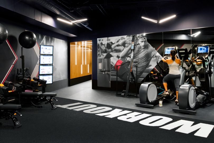
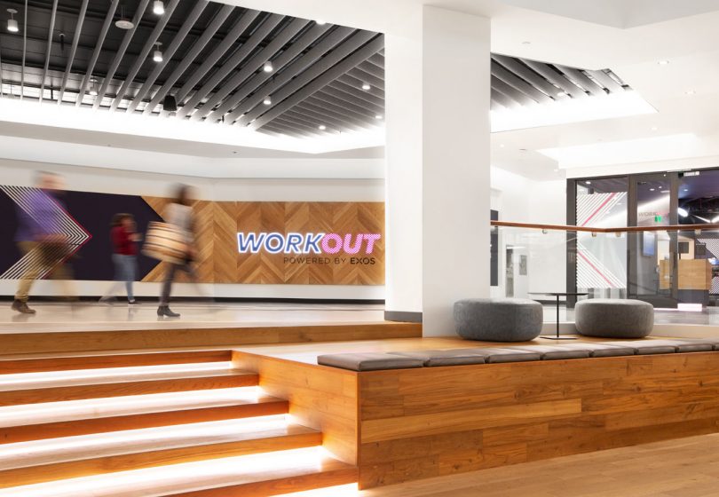
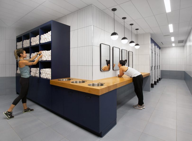
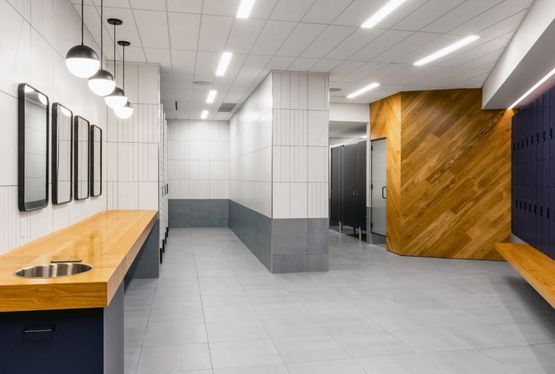
Let’s be honest – most gyms do little to inspire you to join, much less stay to actually workout. If all gyms put a little more effort into their overall design, they’d probably have people joining on the regular and not just January 1st as a New Year’s resolution. Clearly Best Practice Architecture got the memo when designing WORKout, a new gym located in Seattle’s Columbia Center. Several storefronts were taken over to become the new 7750-square-foot location that features open workout spaces with innovative equipment, a classroom studio, spa-like locker rooms, and a private massage suite, complete with a modern scheme designed to energize and inspire members.
A wood paneled portal with embedded lights creates a bold transition between the equipment made for beginner’s and the advanced section.
Best Practice also developed the gym’s new graphics, color scheme, and naming on top of the overall design. Warm, dark colors are paired with dramatic lighting to create a clean, dynamic ambiance that feels warmer and more inviting than the traditional lights that make you feel like you’re performing on a stage.
The bright exercise studio is located along the storefront windows, which are decked out with geometric graphics to prevent those walking by from peering in and making people uncomfortable.
The locker rooms offer a calm, relaxing space for before and after workout times. Italian tiles cover the walls and floors while white oak wood is used for the vanities, benches, and herringbone paneled walls.
Photos by Rafael Soldi.
from WordPress https://connorrenwickblog.wordpress.com/2019/11/04/a-modern-gym-in-seattle-youd-actually-like-to-workout-in/


No comments:
Post a Comment