I’ve been staying in my childhood home since the beginning of the pandemic – and while my parents applied a low-key Early Americana-ish vibe to most of the house (with tables and benches from my grandparents’ Pennsylvania farm, primitive blanket chests, Gaudy Welsh ceramics, etc.), my sister’s and my rooms remained IKEA- and garage sale-filled white boxes. (My mom: “We didn’t think you were coming back.”)
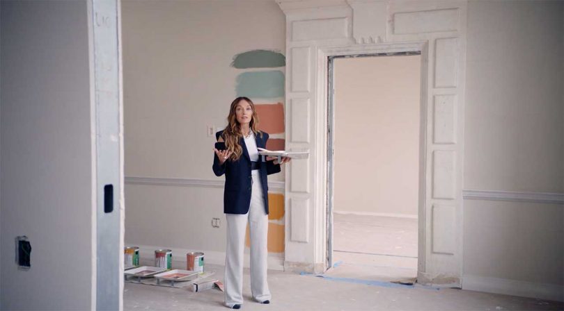
As we prepare to hunker down for the seasons ahead, I’ve struggled with how to revamp this quasi-temporary space – which means I was extremely excited to see Kelly Wearstler’s MasterClass on interior design. Pros: Watching Kelly Wearstler apply paint samples to a white wall in the Proper Hotel in Downtown L.A. is like ASMR for the home design set. I also definitely need a cling-clangy bracelet of metal samples (ideally including various rare and precious metals.) Con: After 150 minutes of instruction, I’m still not 100% on how to handle the 125-square-foot space I’m currently sitting in, but at least now I know to refer to my nascent design scheme as a “story” (drink every time Wearstler says “story” and you will be dead by the end of the class) – and that lemon-yellow (“citron”) paint basically cures all ills.
Here, a few more notes from a class I wish had been twice (minimum) as long:
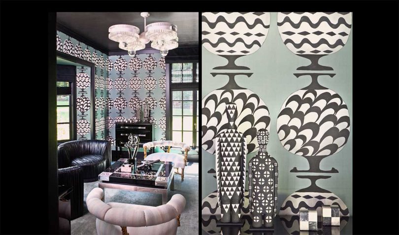
1. Kelly Wearstler names the figures in her paintings/textiles – like Gilda, the inspiration for a private dining room at the Proper Hotel in San Francisco – and she commits to this decision: “You are served dinner on Gilda’s china.”
2. We should buy literally everything that catches our fancy: “Having that incredible teapot with a beautiful spoon when you’re stirring your tea – everything is an experience, and you should make it the best you can at home.”
3. “If we look good, we feel good – and if things are functional, we perform better.”
4. Nothing manipulates space better than mirrors. This is especially true if you’re a we’re-guessing-celebrity client blowing out a 400-square-foot closet to be used for dressing and entertaining.
5. For inspiration, lean into your space’s history, as told by its architectural elements: “Engage with your architecture – what is the hinge? What is the door handle? What is the molding around your window? What is your front door? What is your interior door? In terms of the interior architecture, this is your canvas. This is the space that’s going to hold all the beautiful things that you find: art, furniture, lighting. So really be thoughtful about the canvas you’re creating.”
6. Everyone needs a metal swatching collection that appears to have one sample of solid gold.
7. Color! The most affordable way to get it is with paint. “If someone wants something that’s bright and clean, white and the many shades of white, is perfect for them.” (Choosing a white, she says, is harder than choosing a blue.) For something happy: citron. For “sexy and sensual,” a “beautiful scarlet red.”
8. Watching Wearstler languorously, contemplatively apply paint samples to a room wall at the Proper Hotel in Downtown L.A. basically counts as the day’s meditation.
9. When mixing various textures, think in a single color: “You can’t go wrong with a monochromatic story … All of the materials that are here all have a very distinctive voice and a very distinctive texture, but they work harmoniously together.”
10. Smaller-scale patterns might read as refined whereas its large-scale equivalent will demand more attention.
11. In her personal living room, Wearstler selected her furniture to activate its two primary architectural features: a 15-foot window and a fireplace: “You can have things that look cool and are sculptural, but it’s important that when you have friends and family over, that the function is there, and it’s warm.”
12. Near the end of the session is a walk-through of Santa Monica’s Proper Hotel, which looks amazing. As an ad for the hotel – which appears alongside a “field trip” to the under-construction DTLA Proper (you’ll remember the paint application) and images from the gorgeous S.F. Proper – this is a five-star experience.
Diana Ostrom, who has written for Wallpaper, Interior Design, ID, The Wall Street Journal, and other outlets, is also the author of Faraway Places, a newsletter about travel.
from WordPress https://connorrenwickblog.wordpress.com/2020/11/12/12-things-i-learned-from-kelly-wearstlers-interior-design-masterclass/


No comments:
Post a Comment