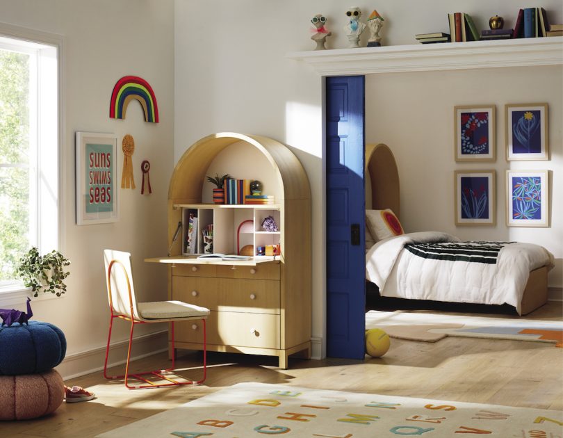
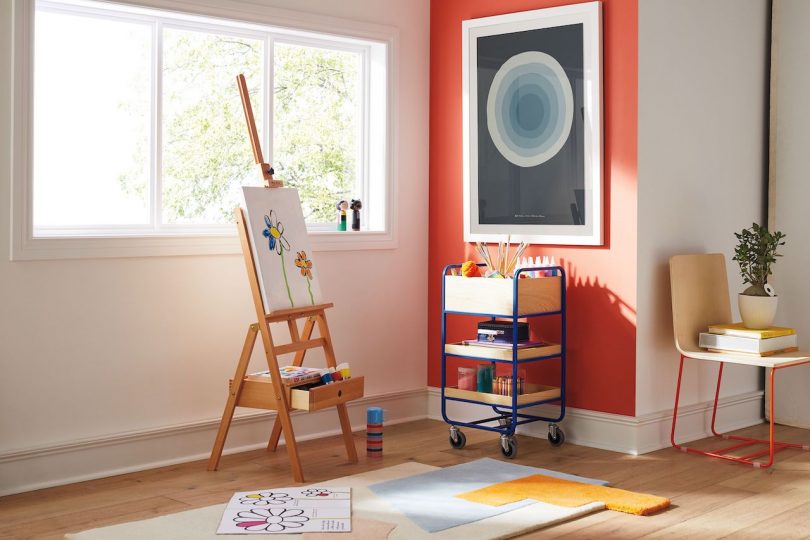
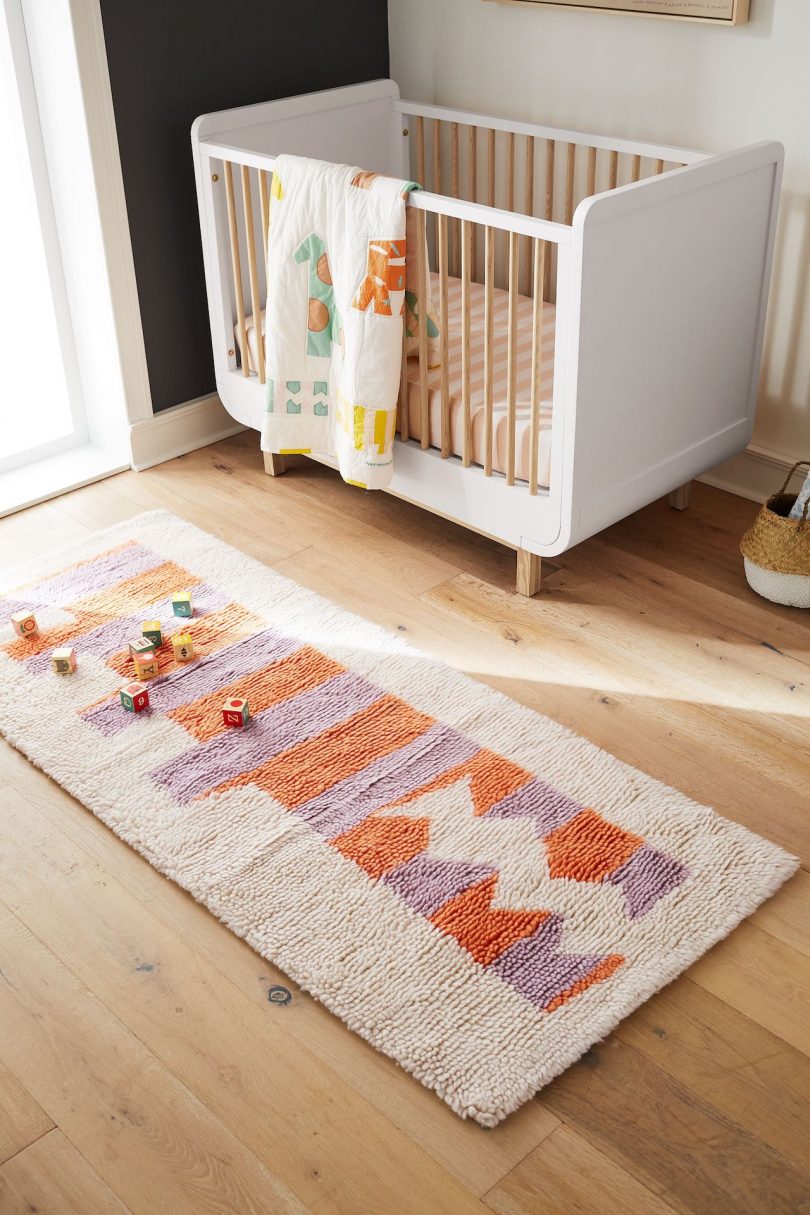
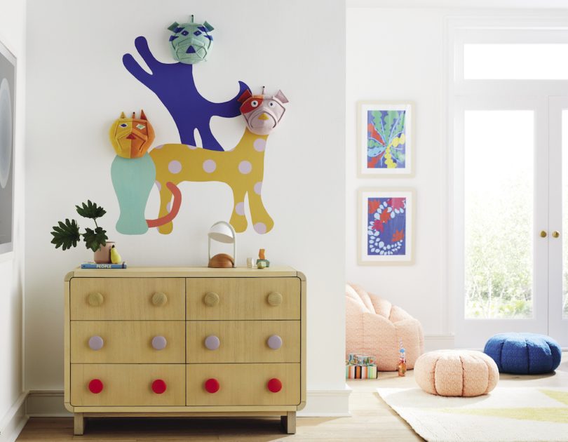
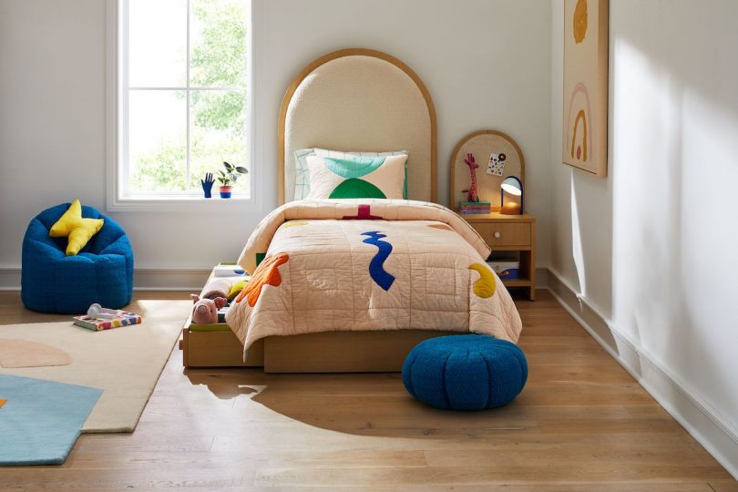
If you didn’t know Kate Berry but just started following her Instagram, you would have thought she was a born and bred New Yorker, with her fabulous rooftop soirees, weekend farmers market jaunts, and insider knowledge of NYC dining culture that should only come after years of living in the city. However, the Chief Creative Officer at Domino actually hails from Southern California, and it was here that she turned to for inspiration when designing Domino’s new collaboration with Crate&Kids. The line of children’s furniture, bedding accessories and room decor is bright and punchy, a design direction that meets at the intersections of Domino’s aesthetic, kids’ preferences, and the ‘80s surf and art culture that Berry grew up with.
But designing children’s furniture is more than just nailing down the color palette and sizing the furniture correctly. As it turns out, Berry drew upon honesty, her childhood, and her experience as a mother raising her daughter in NYC to inform her of this collaboration, as Kate Berry explains in a recent chat with Design Milk:
The Domino aesthetic is very specific and very special, but how would you describe it when you brought it over to a furniture line?
Crate&Barrel had never worked with a publisher and said, we really love Domino’s sense of color *and* your design is accessible.
A lot of the stories we do are not necessarily the highest design. We range, we have some places that we shoot that are very aspiration and I love those, but we also shoot small studio apartments. Maybe some people have really amazing art and furniture, and some people have IKEA hacks that are very clever and smart, so I think they really wanted to work with us for that accessibility and relatability.
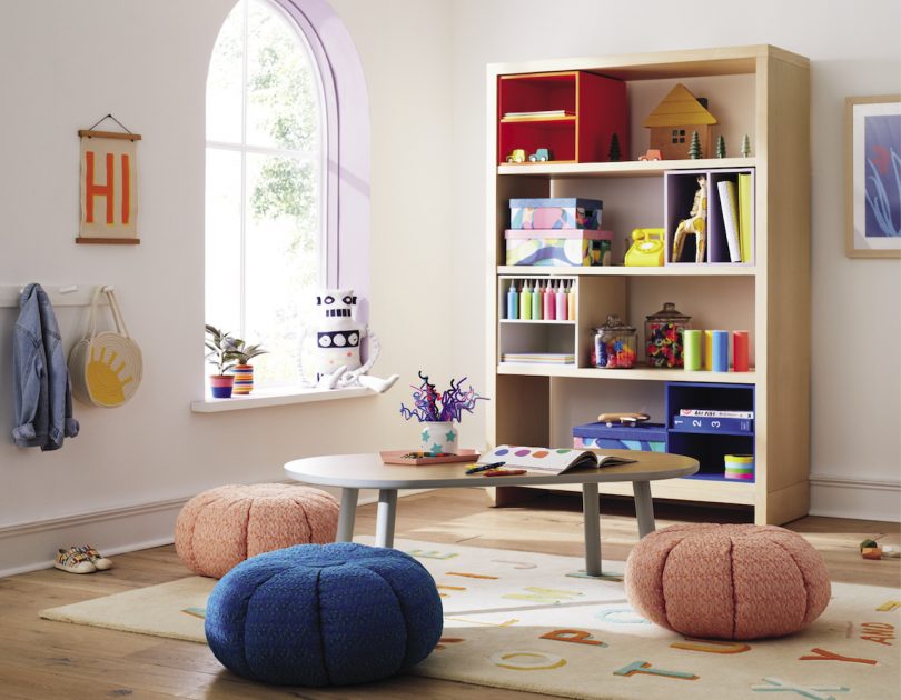
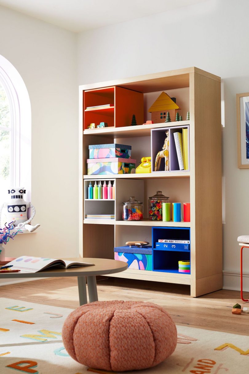
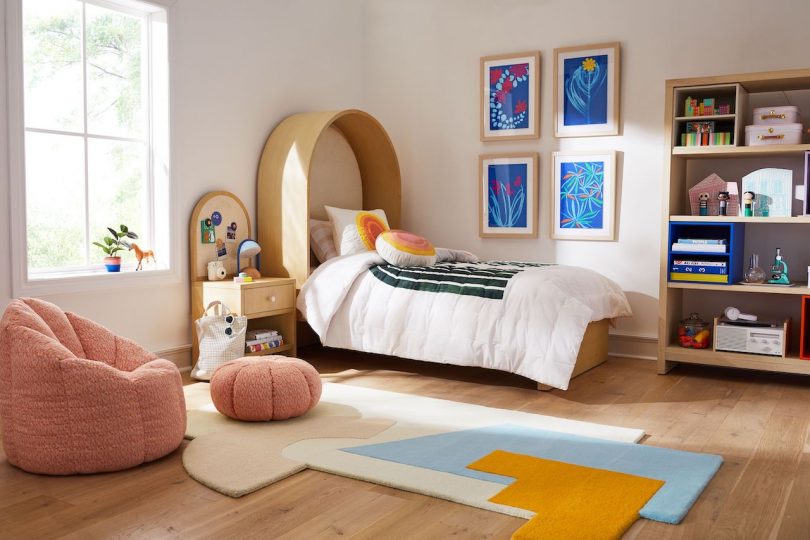
With that in mind, we emphasized on small space. Kids furniture, they make little because they’re kids, but when I think about small space, it’s not about smaller furniture. Actually, a lot of the furniture is big, but it maximizes the space, so going up higher. I really pushed for a bookshelf to be super tall, like why does it have to be this [shorter] height? If we’re talking about small space, we want to maximize.
Or else it’s just lost space.
Exactly. So that was the mentality. We made things that are a bit taller. So it was accessible design, color, and emphasis on small spaces.
What was very important to me was sustainability and modular design. Modular and sustainable meaning, I didn’t want to have something where, once you’re 11, you’re done with it. I wanted this furniture to grow with you.
That was going to be my next question for you. Kids furniture is usually very colorful. I think Domino brings a very optimistic color palette to the collection, which I love. Personally as a mom, I’m always grappling with, do I invest in furniture that can grow with them until they’re teenagers or do I want to preserve them in their childhood moment? Does it need to grow with them or do you think kids furniture should have its own special moment on the timeline of furniture that they’re going to have?
That’s a good question. This is how we tackled that. The furniture should grow with you, most certainly, but what a three- to four-year-old wants versus what a teenager wants is going to be totally different. So the way we imagined it is modularity. There’s a bookshelf, it’s a neutral bookshelf, you can take that to college, you can have that in your living room when they’re grown. But there are these colorful boxes that you can fit and slide in. My daughter Quinn has so many LEGO and plastic toys so you can either throw them in, slide them, and they’re these color blocks, or you can flip them on the other side and they’re shelves so you can put paperwork.
The furniture, definitely. To me, I didn’t want it to be a wasteful thing that you would throw out. This has got to work for a teenager.
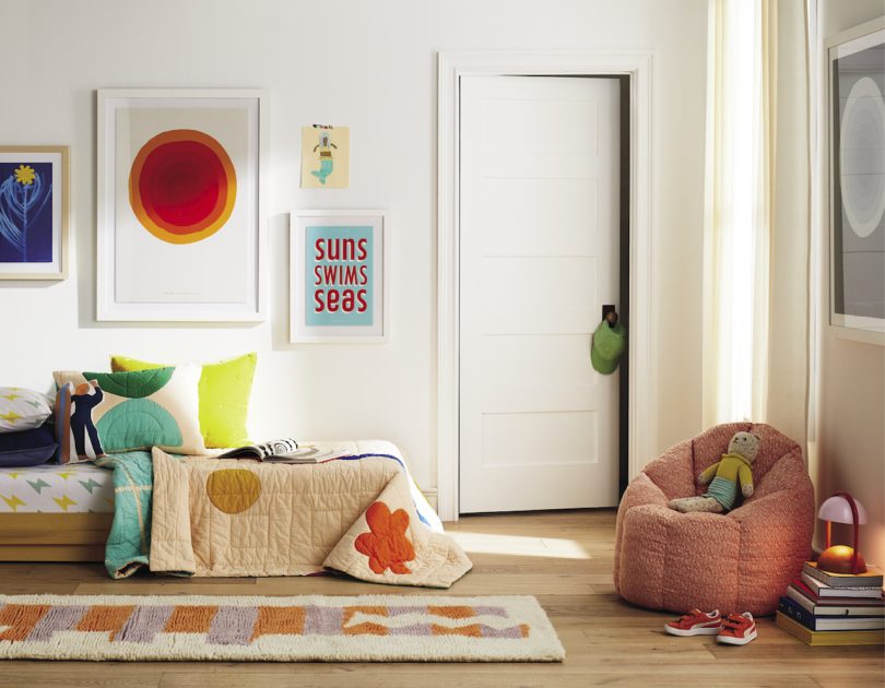
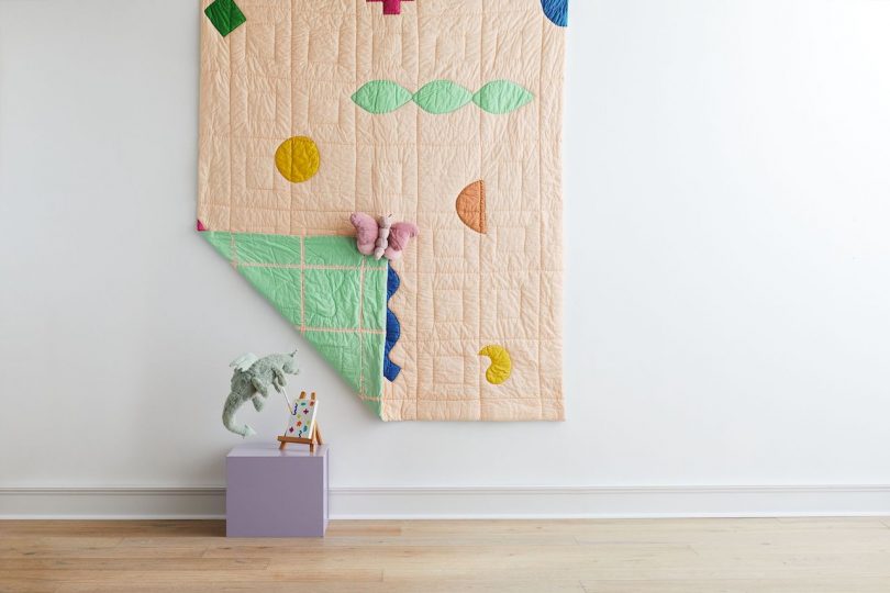
The bedding is where we definitely had this push and pull because I wanted just stripes and things that I would want to live with. But Sebastian (Brauer, VP of Product Design at Crate&Barrel) said, “Here me out. Kids really need something to identify with.”
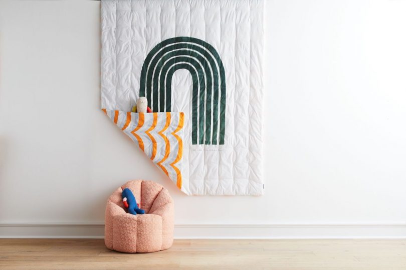
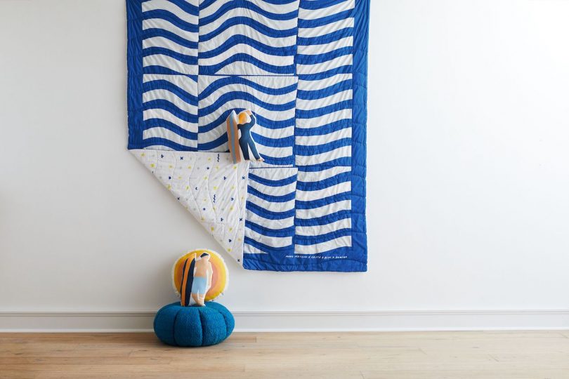
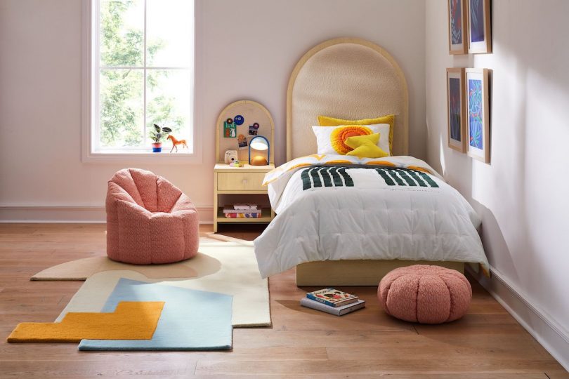
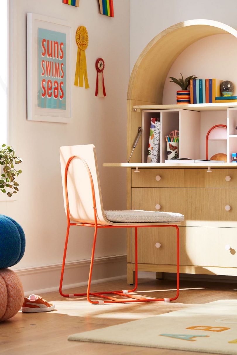
Kate Berry tapped on her artist friends to create some of the familiar figurative and graphic elements that kids would be able to recognize. San Francisco-based graphic artist and surfer Jeff Canham injected fun and playfulness with a glow-in-the-dark, reversible quilt and a Suns, Swims, Seas print that reads the same way upside down. Further down in Los Angeles, Mary Matson adds a whimsical and electric style with surfer cushions and a wavy, beach-reminiscent quilt.
I showed these things to my daughter and some of my friends’ kids’, boys and girls, different in ages. The kids really gravitated towards certain figurative things! So I said, “OK. You guys are the experts.” So there are those moments that are just for the young kids.
At least the main furniture, the things that the parents are investing in, will definitely grow with them, and the items that are a little lower of a price point are the things they can switch out as they grow older.
Yeah, like bedding. You probably are not going to have the same bedding for 10 years. Maybe! But really, you want the furniture to last, so that’s what our thinking was behind that.
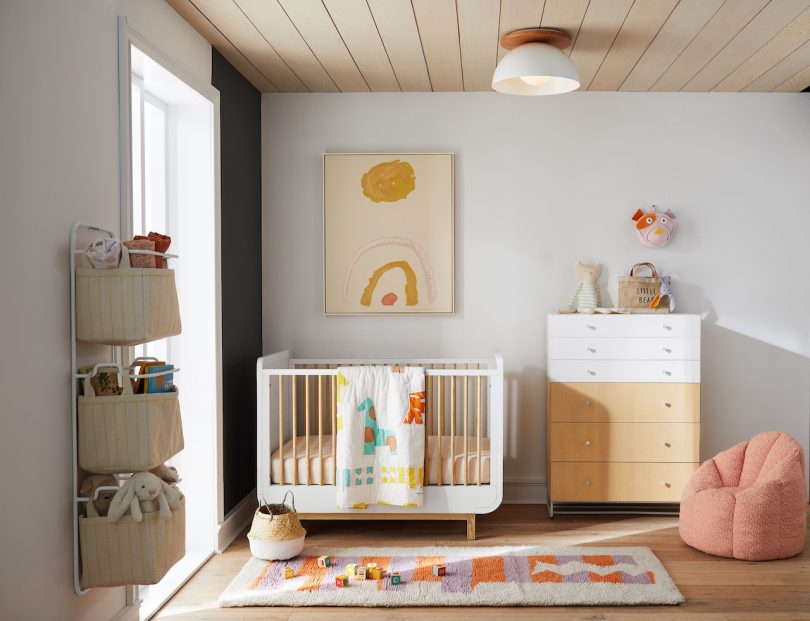
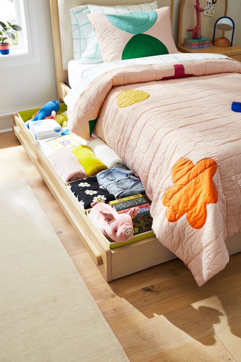
In thinking about storage, Kate Berry leaned on her experience as a mom to her 8-year-old daughter Quinn, a budding creative and artist in her own right who holds the special items in her life so dearly. With the trundle bed and soft storage containers made to fit it perfectly, there can be a home for everything.
Those were specifically designed because of the need I have as a mother. My daughter has all these trinkets that are so special to her. This will happen to you. It happens to every parent I know. You’re going to go in and try edit and get rid of their things. Don’t try to do it when they’re home. They will dig it out of the garbage and go “This is so special to me!”
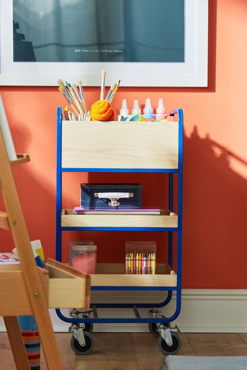
Having these different compartments and things that are accessible to them, my hope is that we’ll give them the tools to be autonomous and be able to organize for themselves where they want to organize. We have a nightstand that has a bulletin board. My daughter makes a lot of art, so to be able to pin that up next to her bed and have her art around her, it’s very important for the way our family lives. I’m going off on a tangent…
No, that’s actually my next question which was how did your role as a mom inform you of these design decisions? It seems like you made sure that kids, even though they’re kids, they have autonomy over their own space and they can curate and grow. All day long they’re told to do things and, in their own safe space that you’ve created for them, they can express themselves, even if they’re two or eight years old.
You can give them these things and you can give them the space, but you’re also kind of teaching them to organize at an early age. However they do it, if they do it or not, it’s their space to do whatever they choose to do with it.
While Kate Berry admits that her own childhood had limited options when it came to kids furniture (she creatively fashioned a vanity from a milk crate and some leftover fabric for her rainbow pinstripe wallpapered room), she is able to draw upon her past in recognizing the importance of designing pieces that, ultimately, needs to make kids feel safe and right at home.
I didn’t have these kinds of choices! I had a Smurf bedspread and I loved it so much. It made me think, oh okay, these figurative things are going to make you want to sleep in your bed. You have to make things that kids are actually going to like, because they have to like it and they have to feel comfortable especially in the bed.
It’s clear that any kid or teenager can find delight in the new collection, but while the furniture and fun accessories can help them become more organized and provide autonomy over their own space, Kate Berry knows that it’s just one of the many lessons we as parents are responsible for in raising our kids.
There are people that teach their kids to be polite and have manners, but I want Quinn to understand why she’s saying thank you to the cab driver. I tell her, “He’s leaving his family, risking his life, making our lives easier, so it’s very important for you to understand that.” She knows why she’s thanking people.
I’m working on that myself with my daughter Nora.
I’m still working on it, we’ll always be working on it, as honest as we can be with them. I think that’s what’s important. I was trying that with this furniture line, to be really real about it and know what parents need.
I think honesty is what really informed your decisions, along with the Domino aesthetic. With your life as a mom and what your kid needs, and in considering what parents need, I think honesty came through with this collection.
Well, thank you!
This post contains affiliate links, so if you make a purchase from an affiliate link, we earn a commission. Thanks for supporting Design Milk!
from WordPress https://connorrenwickblog.wordpress.com/2021/09/24/dominos-kate-berry-on-designing-honestly-intuitively-for-cratekids/


No comments:
Post a Comment