When two people in an office of about 100 employees got tired of listening to their boss’ constant phone calls in 2010, their suggestion of moving them to another spot for calls was met with a challenge – “Well, buy me a phone booth”. With none on the market at that time, the two put their brains together and formed Finland-based Framery. After years of development they launched Framery O, their inaugural privacy pod that’s still the world’s best selling pod today. Now, the workplace industry pioneers have launched a new, larger model of their Framery Q pod, Framery 2Q, that’s a full-size meeting room designed for 4-6 people with a few new enhancements that make it the ultimate multifunctional workspace for privacy and comfort. In today’s Deconstruction, Framery is taking us through the clever updates to make the booth even more comfortable.
The idea for Framery 2Q’s recent enhancements came about following a hiring meeting that Framery’s Head of Products, Lasse Karvinen, was holding in the standard Framery 2Q. Lasse felt the interior was too formal for a motivational conversation with a potential employee, leading to the team designing a more relaxed environment – one that could offer people a more comfortable space to be used in creative and nontraditional ways.
To create more of a relaxed space, a sofa was the first step to make it happen. The design team began the process by using sofas from the “Meeting Maggie” Framery Q model pod, quickly realizing that a new sofa was needed due to visual and ergonomic reasons. The challenge was to design a sofa that met those standards without making the pod interior feel or look cramped.
After working through eight different iterations, the first sofa concept won out, moving it to the prototype stage. Despite their initial skepticism of the design, the prototype changed their minds with its overall design and functionality, as well as perfectly aligning with the brand’s ethos.
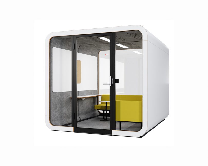
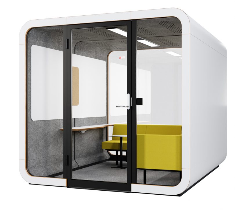
The L-shaped sofa landed along the right side and back glass wall of the pod, based on how it looked, the spacing, and tech requirements.
To add more function to the space, a wall shelf was added to the left hand side where users can benefit from having a table to hold laptops, papers, or a phone. A floating table also comes standard as an additional workstation.
The brand often relies on whiteboards and TV displays for presentations, which led to their addition to the pod. A large whiteboard spans most of the width on the left hand wall allowing lots of space for writing and presentations, as well as easy access to the board.
The curved edges of the whiteboard give nod to the brand’s design aesthetic, easily referencing the rounded corners of the pod itself. The whiteboard is made of a high quality magnetic glass board making writing a pleasure and cleanup and maintenance super easy.
The whiteboard is composed of two pieces with a rectilinear hole in the middle. Cord was used to fill the space, adding the function of a bulletin board while bringing a new design element. The corkboard features magnets on the back allowing users to attach or remove it easily.
To select which cork was to be used, a vote was held to determine which was most visually appealing and of the highest quality. In the end, a cork with larger grain was chosen for its look and ability to hold up under frequent use.
Additional tweaks were make to finalize the corkboard’s appearance, even underneath where a birch plywood plate was added to fill the hold around the cork.

Finished interior where you will see the Framery 2Q with the L-shaped sofa, shelf, floating table, and whiteboard.
Another challenge the team faced was how to electrically outfit the pod. The design team was able to design it in such a way as to hide the cords and outlets underneath the wall shelf and sofa. The brace that supports the wall shelf perfectly houses an electrical outlet out of sight but easy to reach.
The newly finished Framery 2Q complete with an L-shaped sofa for a relaxed, private meeting space for between 4-6 people.
Removing the pole from the back glass wall of the original Framery 2Q design was a major achievement for the design team. The pole was used to hold the electrical cords and as the control panel to adjust the pod’s lights and ventilation. With the new sofa, the pole was a visual distraction and didn’t work ergonomically for the layout, sending the designers back to the drawing boards to rethink the electrical situation which they successfully resolved.
The enhanced Framery 2Q features a UI-panel for lighting and ventilation right beside the door, much like it would be found in a regular room. It’s also easy to reach from the sofa. The sofa’s position facing the whiteboard and TV screen means users won’t strain their necks while watching presentations.
The removal of the electrical pole made way for large panels of glass giving a feeling of openness inside the pod.
Learn more about the Framery 2Q here.
from WordPress https://connorrenwickblog.wordpress.com/2020/03/10/see-how-the-framery-2q-gets-an-upgrade-for-a-more-relaxed-space/


No comments:
Post a Comment