The following post is brought to you by Squarespace, an easy-to-use website builder for your personal and professional needs. You can start a free trial for a website (with no credit card required) today and use coupon code DESIGNMILK for 10% off your website when you’re ready to publish. Our partners are hand picked by the Design Milk team because they represent the best in design.
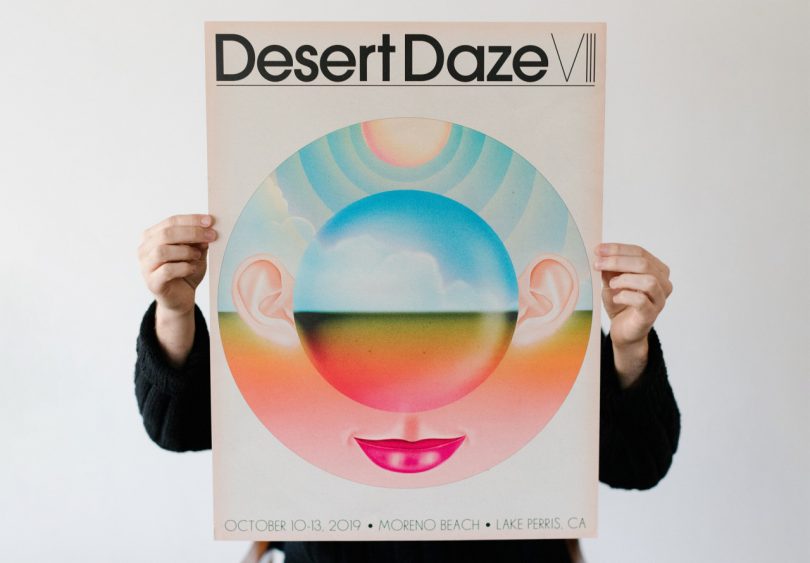
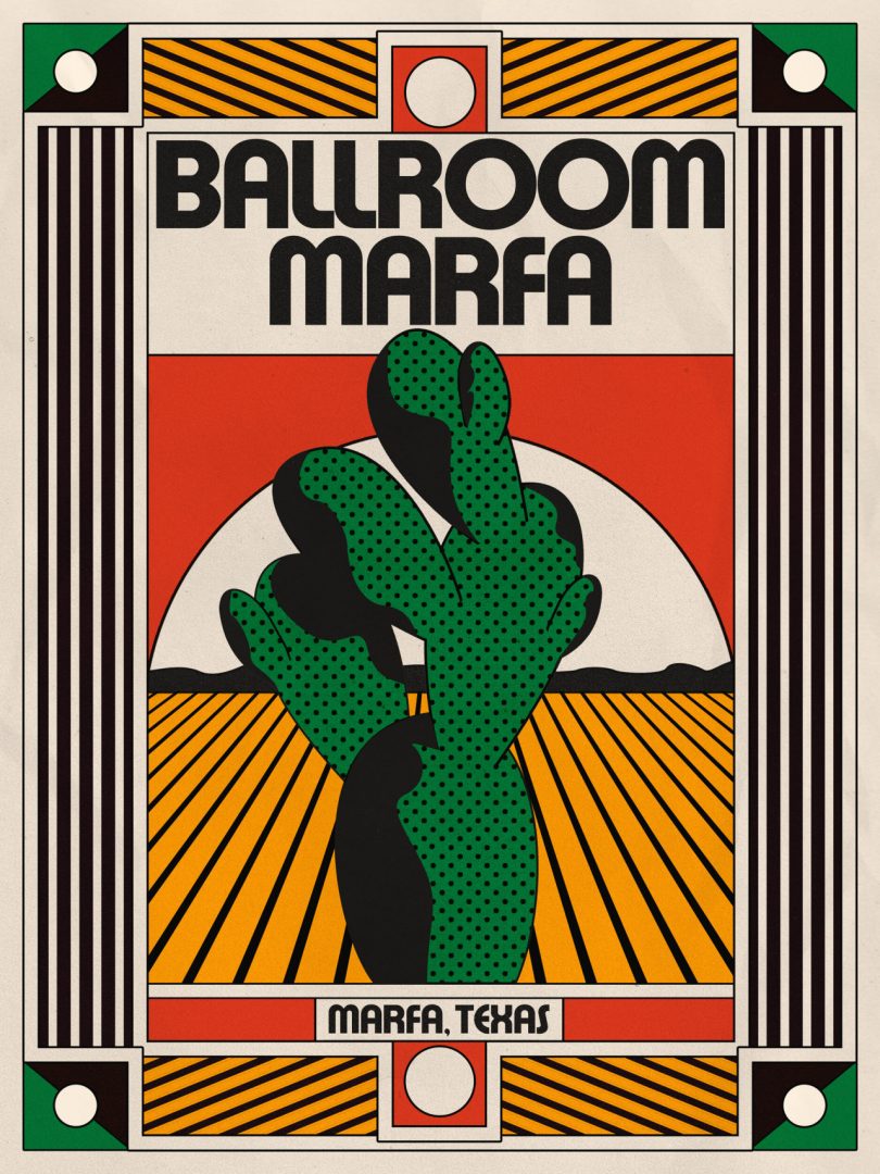
Entering the world of Indiana-based visual artist Aaron Lowell Denton can feel like stepping through the doorway of an astonishingly preserved record shop you’d long had forgotten – a realm embellished in the hallmarks reminiscent of Stanislaw Fernandes’ finest OMNI magazine covers, the Memphis Movement, forgotten classics of the 1980s Japanese city pop albums era, and maybe even the neon hued geometric landscapes once emblazoned across blank VHS cassette tapes. With a portfolio pulsing with a surreal experimental glow, Denton has carved out a career as a musician’s artist, one adept at mining the collective memory of music’s imprint onto our emotions, expressed through an Indian summer spectrum of colors and absurdist’s sense of movement.

Photo: Anna Powell Denton
Originally from Upland, a tiny little town in northern Indiana, and now based in Bloomington, Indiana, Denton’s journey follows the trajectory more that of a squiggle than a line. “[When I first moved to Bloomington] I had a slew of day jobs before I went full time with design. I served tables at a vegetarian restaurant here in town called The Owlery,” says Denton, “I also painted houses for a while, alongside some carpentry work. I worked the door at a bar during a 10pm to 4am shift. That was a weird time.”
Between this hodge-podge of jobs, Denton was also designing flyers and posters for a local musical venue for the love of it, sometimes for just $50 a pop, but mostly for free. Over time he found himself spending an extraordinary time on these projects despite the modest pay. It was only when his then-partner-now-wife suggested making a go of a career as a visual artist that Denton decided to abandon toiling 70-hour weeks to dedicate himself fully into his design work.
“I was super scared to quit my restaurant job. I figured I’d try it for a few months and go back to waiting tables, but it worked out! I feel super grateful to have the job and life I have. It’s a privilege, especially in times like these, to be able to work for yourself and make art for a living. I can’t believe I get to do it everyday.”
The world would soon come knocking on Denton’s door by way of Instagram, where his work garnered a great deal of attention from design and music aficionados alike. He’d soon find himself inundated with commissions by promoters all seeking Denton’s uniquely hypnotic pop manifestations for the likes of musicians such as Wild Nothing, Leon Bridges and Khruangbin, John Maus, and Stereolab, tying a lyrical sense of typography together with a heart-on-his-sleeve affection for artists such as Donald Judd, Joan Miró, Helen Frankenthaler, and Bridget Riley.“That high art stuff is a bit in my aesthetic DNA at this point, and my sense of color and composition comes from all the time I spent (and still spend) in museums and looking in books.”
Today Denton’s eye finds itself drawn toward other outliers of art, including surreal futurist Stanislaw Fernandes, 1960s-1970s Japanese typography, and OMNI magazine, influences clearly discernible across his portfolio, “I also got into a big city pop phase last year that resulted in a bunch of work in that style. I just get really into looking and researching a certain style, and I think it’s fun to sometimes try on styles and techniques. It’s a way to give yourself permission to experiment and grow.”
This growth also included designing his own website on Squarespace, where his online portfolio resides alongside an e-commerce shop where some of his more recent work is available as posters. The site has become an integral extension of his online presence, allowing him to connect with new clients and customers alike. Denton remembers designing his site as surprisingly “easy”, crediting Squarespace’s robust site building tools. “There was definitely a time when building a website felt like such a feat, but it’s just not that way anymore.”
Denton also cites an appreciation for the collaborative nature of his work. As a musician himself, he calls the process a “conversation” integral to informing his eventual solution in tying together his vision with the artist, the venue, and even the audience. It’s a process he’s embraced increasingly more as he ventures solely from poster work toward collaborative commissions.
“Part of the art in it for me is the dialogue with clients, and the personal connection that can come out of creating art together,” notes Denton, “Especially when you’re representing someone else’s art with your own, that process has to be collaborative. That being said, like I mentioned, musicians can understand the need to not be caged in too much. They can empathize with needing a certain amount of autonomy to find something unique.”

“I’ve been lucky to work with some of my favorite musicians and it does sometimes feel like it’s coming from somewhere mysterious, pre-cooked.” Promotional risograph poster for Wild Nothing. September, 2018.
When asked about what makes for a good poster or album design, Denton is quick to point out the open-minded nature of his clientele – musicians – has afforded him a fairly relaxed relationship that tends to foster, rather than hamper good design.
“[Musicians] tend to be less intense than say, an art director. When I do a poster there’s not much between my idea and execution and the final piece; whereas, with something like a logo for a business, or a commercial project, it needs to be discussed and examined. That can be fun too…it’s all just different.”
These fairly unrestricted bounds have permitted Denton a level of interpretive freedom not all designers are always given, allowing the artist to consider both the complete oeuvre of the musician with his own personal connections with their music to form novel solutions. “I sometimes feel like the bands I get asked to work for already have visual representations, fully formed, sitting somewhere inside me. Like, they’re formed from my own relationship with the music and fandom.

“Design has a rich history of endearing social messages with imagery. With the Abolish ICE poster I was working with a group called New Sanctuary Coalition to raise funds for immigration bonds, which are exorbitantly higher for people in that system. I’d love to collaborate on more social posters in the future though, it’s an area of my work I really value.”
Amusingly, Denton’s affinity for collaboration even extends to the nuts and bolts of operating as a one-person operation. “I actually enjoy emailing quite a bit,” admits Denton, “The dialogue between me and my clients is something I’m actively interested in. I don’t dread any of that stuff.”
Denton credits his Squarespace designed site as an alternative medium to show work outside of social media, one where his work can be shown without the expectations and associations of an audience-based medium like Instagram. “I like to think of my site just as a full view of a collection of work. It’s the fastest way for someone to see what my work is all about.” Visitors are welcome to peruse his portfolio of work and purchase posters from an e-commerce shop vertical. Denton’s design is clean, simple, and easy to navigate, permitting his artwork to be the centerpiece of the experience.
Squarespace has made selling my work all around the world a more accessible possibility. The commerce tools are really easy to use and understand.
With a majority of his past work connected to the music industry, Denton is using his site to aid in pursuing new opportunities, both out of curiosity and out of necessity, “When COVID hit, a majority of my poster work evaporated, so this year has been a lot different as far as where the work is coming from. I’ve been doing more editorial jobs, which I’m really into. I’d like to do a book design at some point, and also want to do more movie posters. I’m trying to learn about motion design in my spare time, so I could see myself trying that at some point.”
Ready to share your vision or brand with the world? Take the first step today with your very own website with Squarespace. Start your free two week trial (no credit card required!) and use coupon code DESIGNMILK when you’re ready to get 10% off.
from WordPress https://connorrenwickblog.wordpress.com/2020/08/17/aaron-lowell-denton-the-accidental-designer/


No comments:
Post a Comment