The following post is brought to you by Squarespace. Our partners are hand picked by the Design Milk team because they represent the best in design.
Individuals who consider themselves creative usually have some crossover in mediums and disciplines, sometimes their current body of work is lightyears away from where they first began. Aside from that, few artists have the ability to successfully transition in a professional way from one medium to another. Then there is Lindsey Hampton. An established professional in both the worlds of graphic design and ceramics where the two meld together seamlessly through her aesthetic. We talked to her about practices, her two-pronged cross-discipline business, and how Squarespace’s selection of award-winning templates, e-commerce capabilities, and marketing tools help her business thrive.
The first thing we had to know is whether design or ceramics came first in Lindsey’s creative evolution. How do the two practices play off of one another when she’s creating? What commonalities emerge?
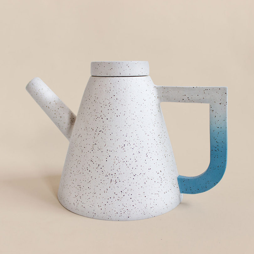
“Design definitely came first. I started my career as a graphic designer long before I ever touched clay. so my design brain was pretty strong by then. And because I’ve spent a long time in that headspace, I approached ceramics in a very similar way. It’s still a visual communication, it’s still problem-solving. If I want a handle to be a certain shape, what shape should the body be? Both practices are all about balance, weight, and space. They are both about evoking a feeling,” Hampton shared with us.
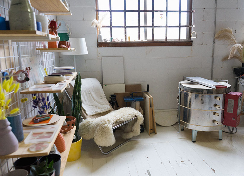
You can have a dozen graphic designers, ceramicists, etc. in the same room, working on the same project, and each one will approach it differently. Ideation and process are endlessly fascinating and we wondered how Lindsey approaches her work, in this case what creating a piece of ceramics is like in her studio.
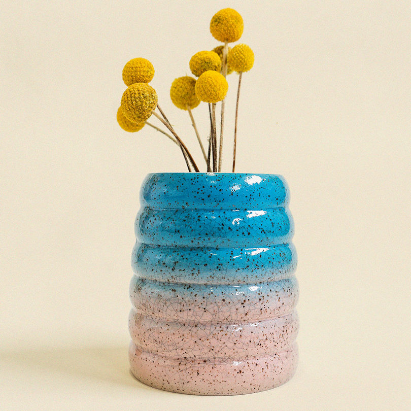
She says, “There are mainly two processes I go through, a production method and a more organic method. The production method is very meticulous. Clay is weighed to a specific amount and then thrown to exact measurements. I keep a book where I sketch out and jot down the measurements and weight of any and everything I’ve ever made more than one of. The organic method is when I just take a hunk of clay and throw it down without any preconceived notion to see what it’s going to end up as. Each move is made in the moment. Even when it comes to glazing, I rarely decide beforehand what I’ll end up doing, I really just try to let it happen. It’s often that things I make organically end up being transferred into production but not always, sometimes it’s nice for something to just live as it is but I think I need the balance of both to be able to make things work.”
Rarely will you find two businesses that have taken the same path, so we often wonder where one has come from and how it arrived at its current place. Lindsey’s design and ceramics business has its own trajectory that we wanted to know more about.
“I know that I wouldn’t be doing what I’m doing without Instagram, but that was really just good timing. I started posting my work right from the beginning when Instagram was in its infancy. There was that exciting time when you’d discover someone new every day, and shops and boutiques and artists and designers were all new on the platform and just super stoked to be finding each other. I was able to start selling my work at some great shops and the demand kept building. I was working a full-time design job that paid well but that I didn’t necessarily like, which made it easy to leave and set up my own studio. I’ve been able to dedicate a lot of time to build things slowly and never produce more than what people wanted. It’s still not something I think of as a business, I’m just a person that makes things that people buy. It’s nice!,” Hampton said.
It’s tough running a business on your own, so it’s nice to be able to reach out to trusted partners to handle the things you know nothing about. We talked to her about how Squarespace helps to streamline her business and allow her to focus on creating.
“I’ve always loved grid style portfolios, it’s so nice to be able to get an overall vibe of someone’s work in a single glance. That’s what drew me to Wells template. I did a lot of editing of my photos so they would work well as a whole set when you view them in a grid. I focused a lot on the type and the colour palette, and I stuck with two typefaces and three colours, being confined to only a few elements makes it feel really crispy and consistent.,” Lindsey said.
She also shared, “There’s an ease to Squarespace that makes it feel like you don’t totally need all of your shit together to be able to look like you do. I’m a one person studio so being able to make something, photograph it, put it online, and sell it is very gratifying. I’m solely involved in every single step and I never have to worry about the e-commerce side of things. I know that if I put something up and someone wants to buy it, it’s no problem at all, it’s easy for them and me. There’s a lot of trust there.”
All photos courtesy of Lindsey Hampton.
Ready to get to work on your site? Take the first step with a Squarespace website. Use coupon code DESIGNMILK at checkout to get 10% off your first purchase.
from WordPress https://connorrenwickblog.wordpress.com/2019/04/22/how-lindsey-hampton-creates-for-her-cross-disciplinary-shop/


No comments:
Post a Comment