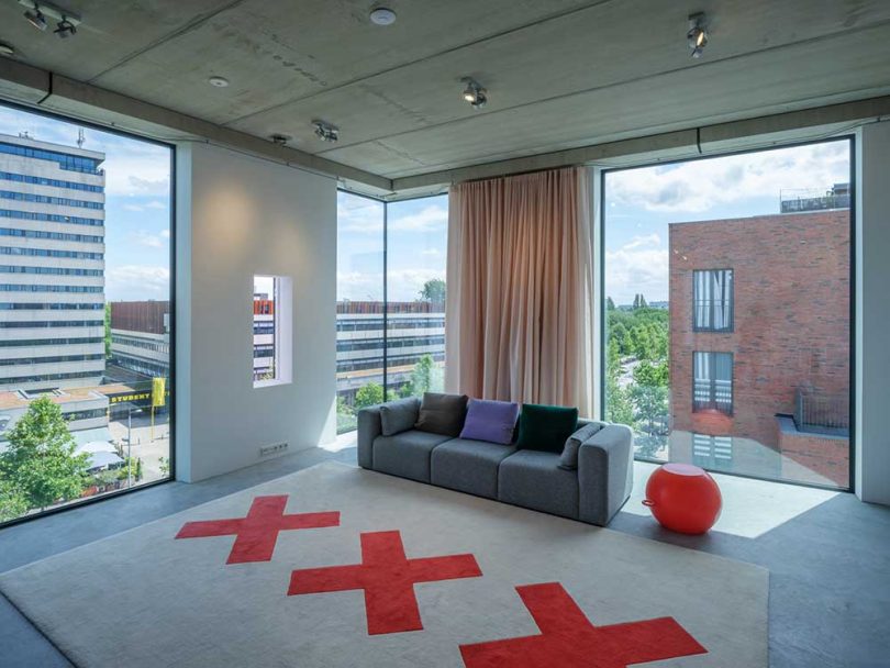
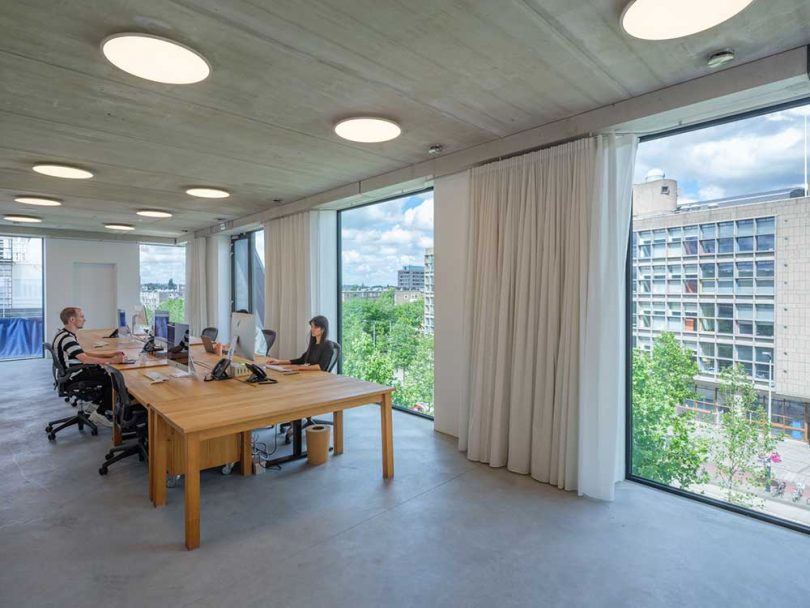
Graphic design studio thonik recently completed their new, self-designed and built studio in Amsterdam, a project that marks their first three-dimensional design. Thomas Widdershoven, thonik’s co-founder, designed the studio in collaboration with MMX Architects as a “spacial manifesto of thonik’s design philosophy, characterized by social commitment and a playful take on modernism’s heritage.” The project took 12 long years to design and complete the build as the business requirements and needs changed over time, but the wait appears to be worth it when you see the finished results.
The new studio lives within a mixed-use building where it occupies two floors. A sake bar is located on the ground floor and a Japanese Omakase restaurant is on the first floor, while an event space named ‘the thonik loft’ takes up the top floor and a rooftop terrace gives visitors 360-degree views of Amsterdam’s inner city and financial district.
The graphic exterior is clad in 1cm-thick Trespa® Meteon® Lumen panels that alternate in horizontal, vertical, and diagonal lines for a bold, photo-worthy statement. The linear pattern gives nod to a typeface designed for the 1968 Olympic Games in Mexico, called Mexcellent.
The diagonal extension on the front disguises an exterior staircase that takes visitors to the rooftop terrace.
Massive floor-to-ceiling windows add to the exterior’s dramatic look while offering views of the city as well as letting plenty of natural light inside.
The building is all-electric and produces zero emissions thanks to the windows which are triple glazed and layered with a special UV coating, and the air source heat pump that keeps the indoor temperature regulated.
The interior stairs received their own graphic pattern of interwoven linear strips that wind their way to the top floor.
Photos © Ossip.
from WordPress https://connorrenwickblog.wordpress.com/2020/09/02/studio-thonik-makes-its-graphic-mark-on-their-own-new-studio/


No comments:
Post a Comment