When visitors enter the Prague offices of DDB, they’re unknowingly met with an optical illusion that forms the creative agency’s logo. The visual treat, along with the office, was created by B² Architecture to appear perfect at the entrance. As one moves around it becomes clear that it’s an anamorphic illusion that playfully projects color into the office space. Moving around the office, one would never know unless they spotted it at that specific vantage point upon entering.
Once inside, the black, white, and blue colors look to be organic shapes of color that liven the interior space up.
The clean white surfaces further inside draw visitors in where they’ll spot a colorful wall of upholstered stools, which are arranged to look like their logo. The wall display is used as a creative solution to store extra seating for when it’s needed. When a group meeting or presentation is happening, employees can easily pop a stool out and have a seat.
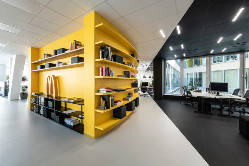
Situated in the middle of the offices is a yellow, semi-circular, arena-like space used for brainstorming. The glass walls keep visibility open while working as a surface to write notes and ideas. Curtains are available for additional privacy when needed.
Photos by Alexander Dobrovodsky.
from WordPress https://connorrenwickblog.wordpress.com/2019/07/17/b%c2%b2-architecture-creates-optical-illusion-for-a-prague-creative-agency/


No comments:
Post a Comment