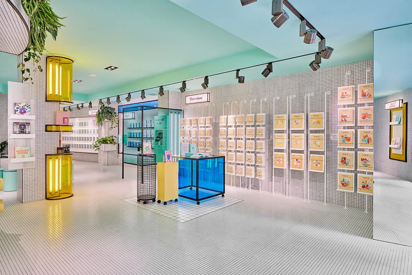
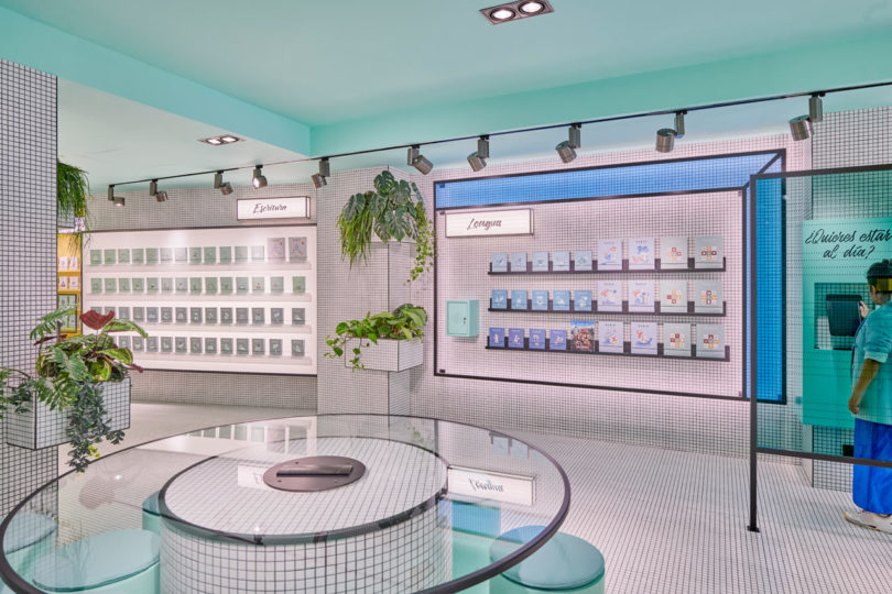
Masquespacio is no stranger to the digital pages of Design Milk, and with good reason. Their unique approach to creating spaces helps bring brands to life with an appeal that makes you want to delve in and explore more. Their latest project is a concept store in Valencia for educational publishing house, RUBIO. Ana Milena Hernández and Christophe Penasse designed a lively, futuristic space that encourages interaction through a series of different environments.
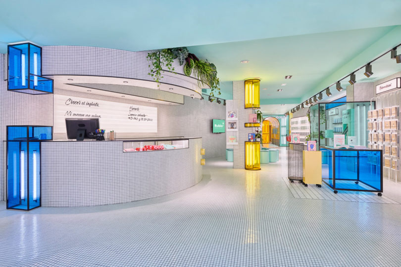
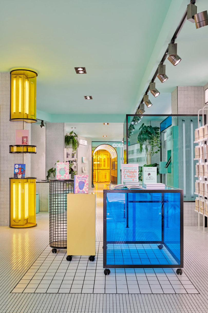
The design duo looked to RUBIO when it came time for inspiration, as they were intrigued by their branding and aesthetic that had been built over the last 60 years. Masquespacio perfectly merged the brand’s storied past with their intended future through the use of vivid colors, neon, and acrylic panels that are grounded by white square tiles used to resemble blank paper, something you’d find in RUBIO’s workbooks.
Visitors to the flagship store are invited to check things out right from the start as the rounded counter guides people in to discover the math, writing, and reading workbooks area.
The math section features panels with blackboards on the back allow visitors to practice their math skills. There’s another spot to practice handwriting.
A color tunnel leads visitors to explore the world of RUBIO, which includes a projection room for the young ones.
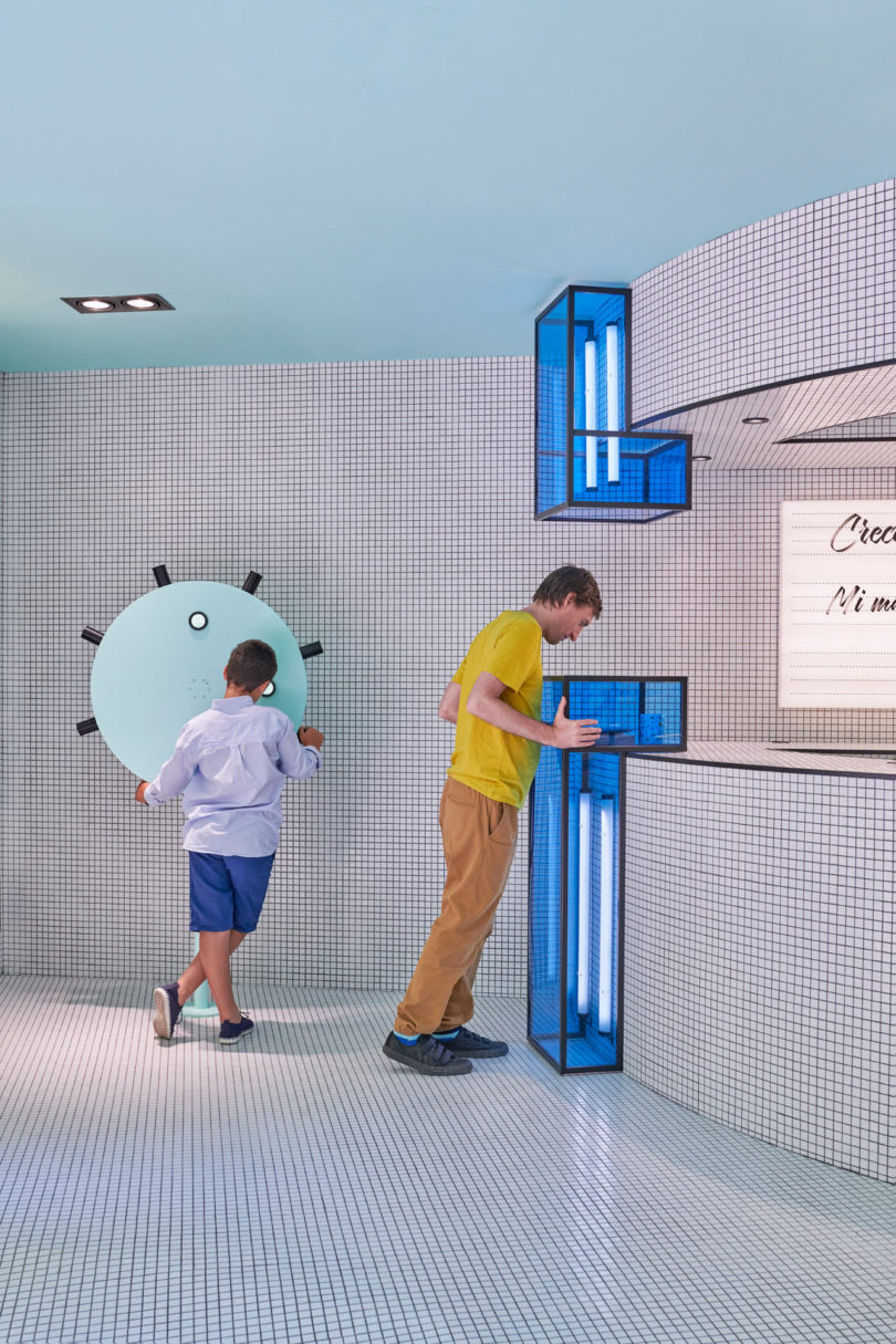
Other spaces and activities to check out are a peep-hole, a time machine with augmented reality goggles, a roulette that shares the brand’s history, a speaker that shares stories, a tunnel of color, and a projection room.
Photos by Luis Beltrán.
from WordPress https://connorrenwickblog.wordpress.com/2019/07/05/masquespacio-creates-an-interactive-concept-store-for-rubio/




No comments:
Post a Comment