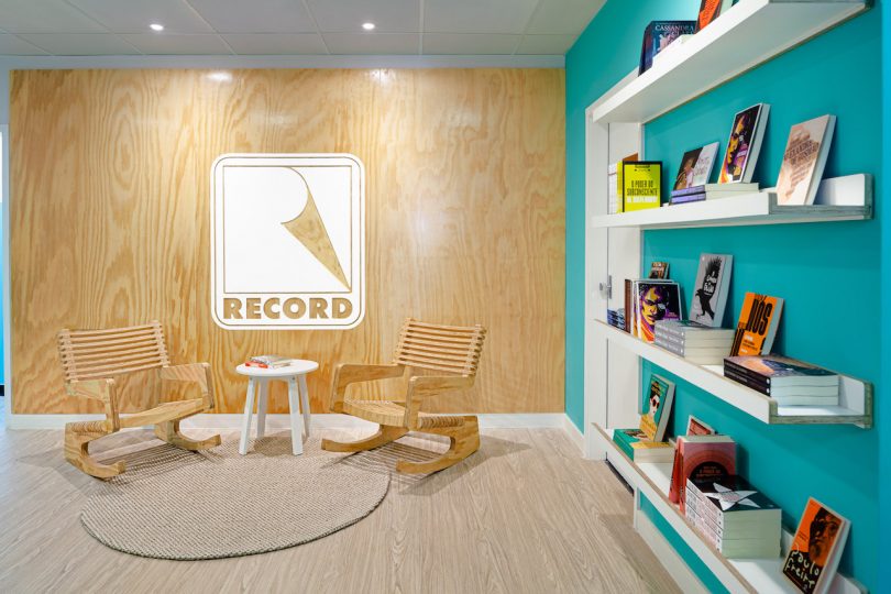
Editora Record, one of the oldest and most famous publishers in Brazil, recently got a modern office makeover by STUDIO DLUX. The project began in late 2019 and only had the creative brief of modernizing the space. Over time, the brief took on a more strategic tactic that proposed reformulating the division of workspaces between the editorial and marketing teams. The result is the separation of the two groups to two different, color-coded floors with more fluid floor plans to allow for better collaboration and privacy when needed.
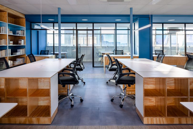
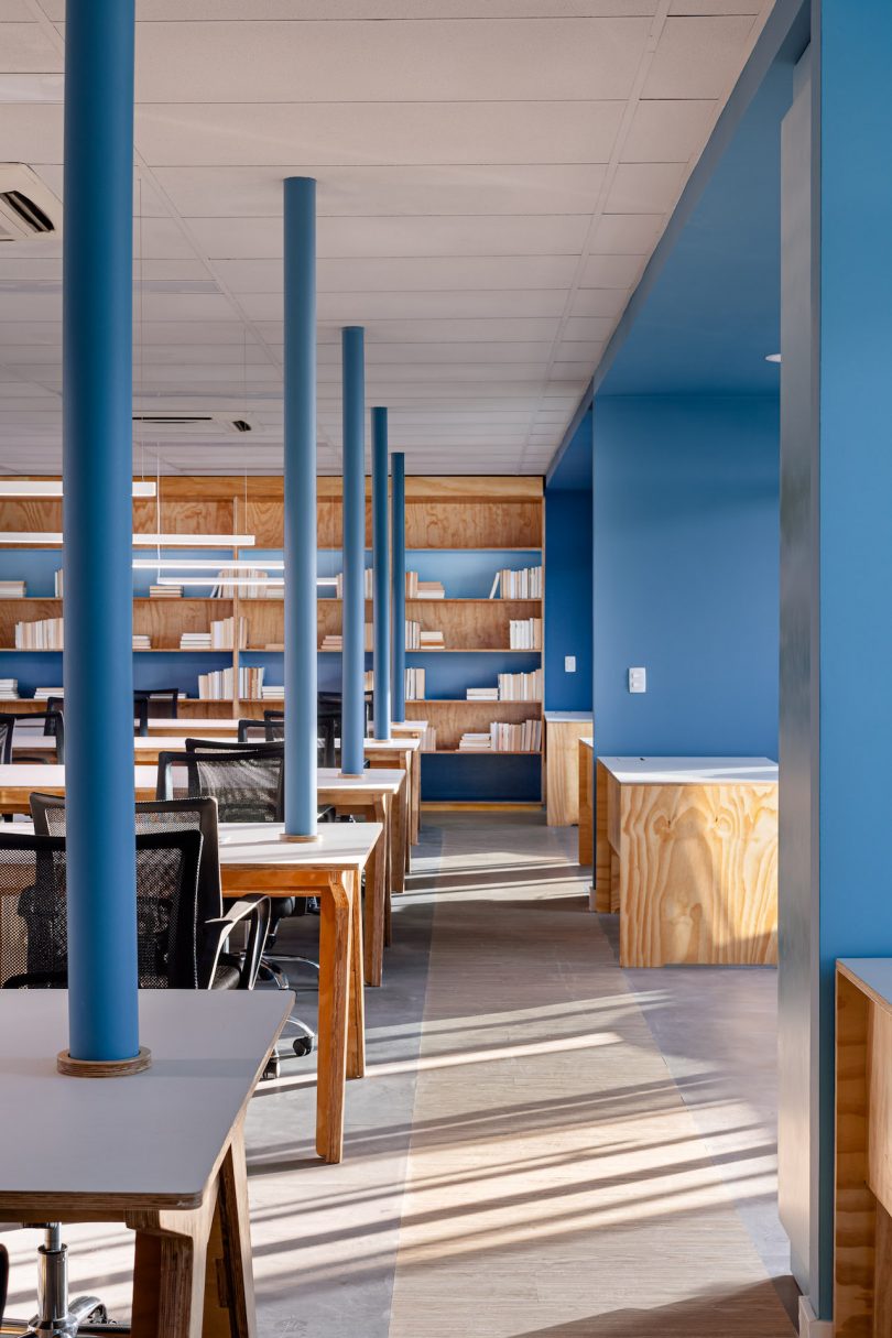
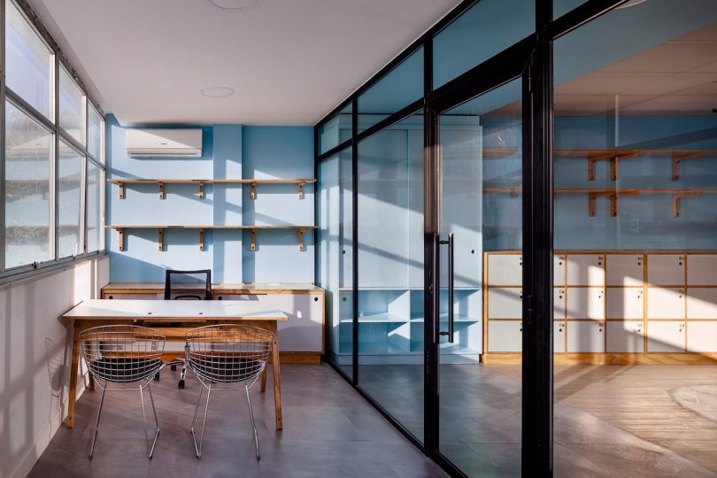
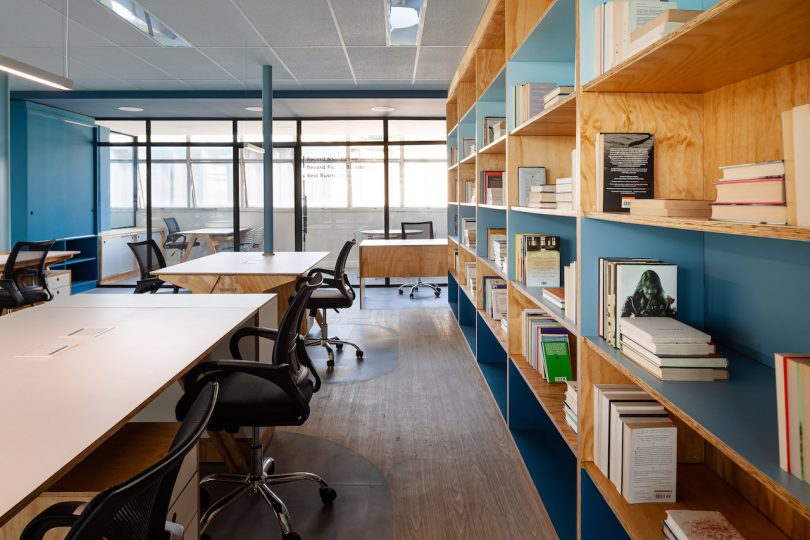
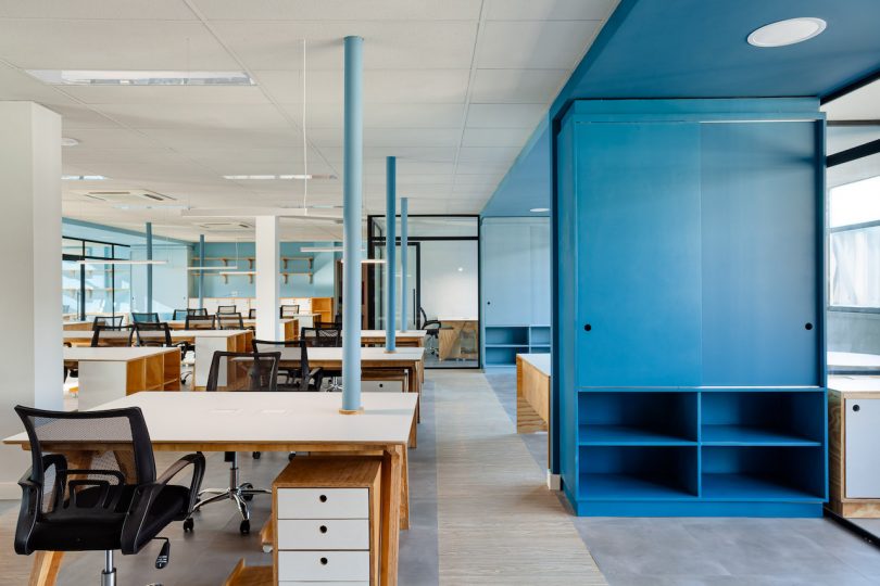
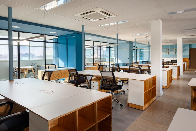
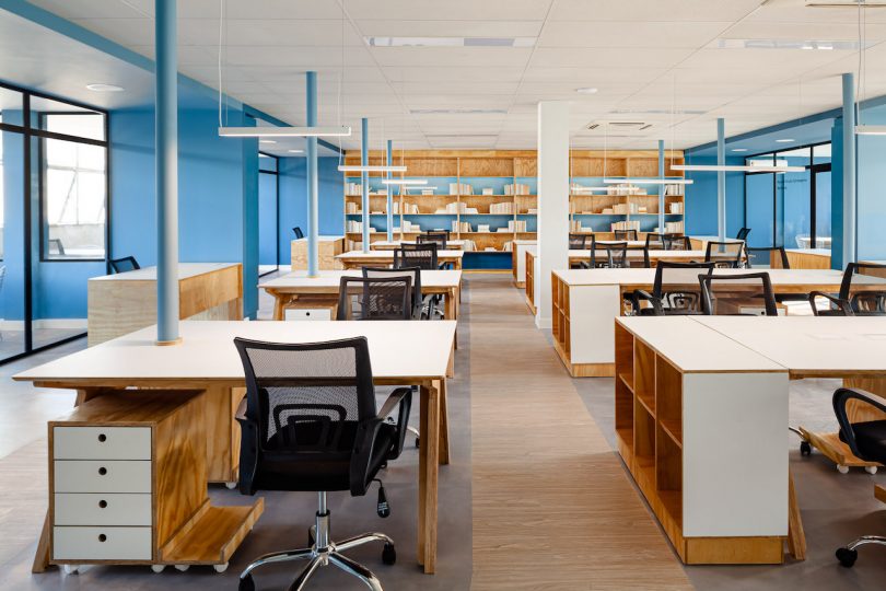
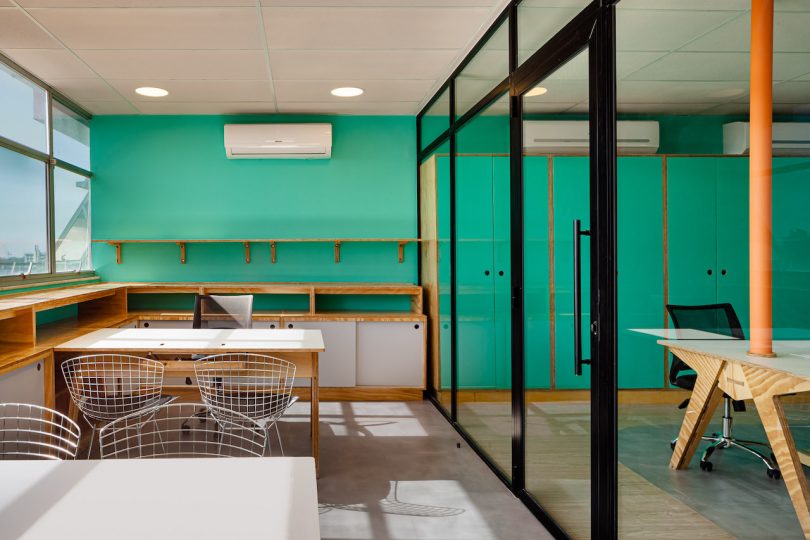
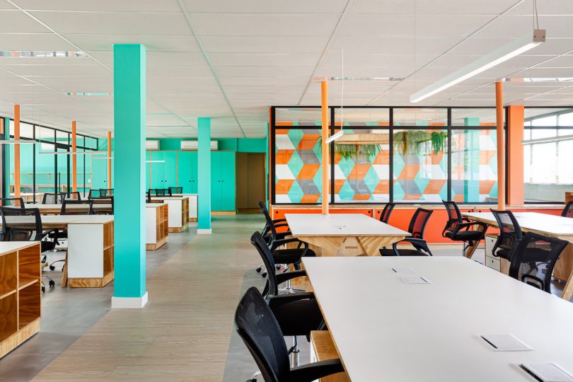
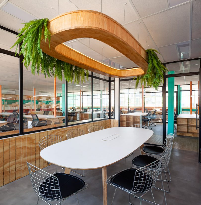
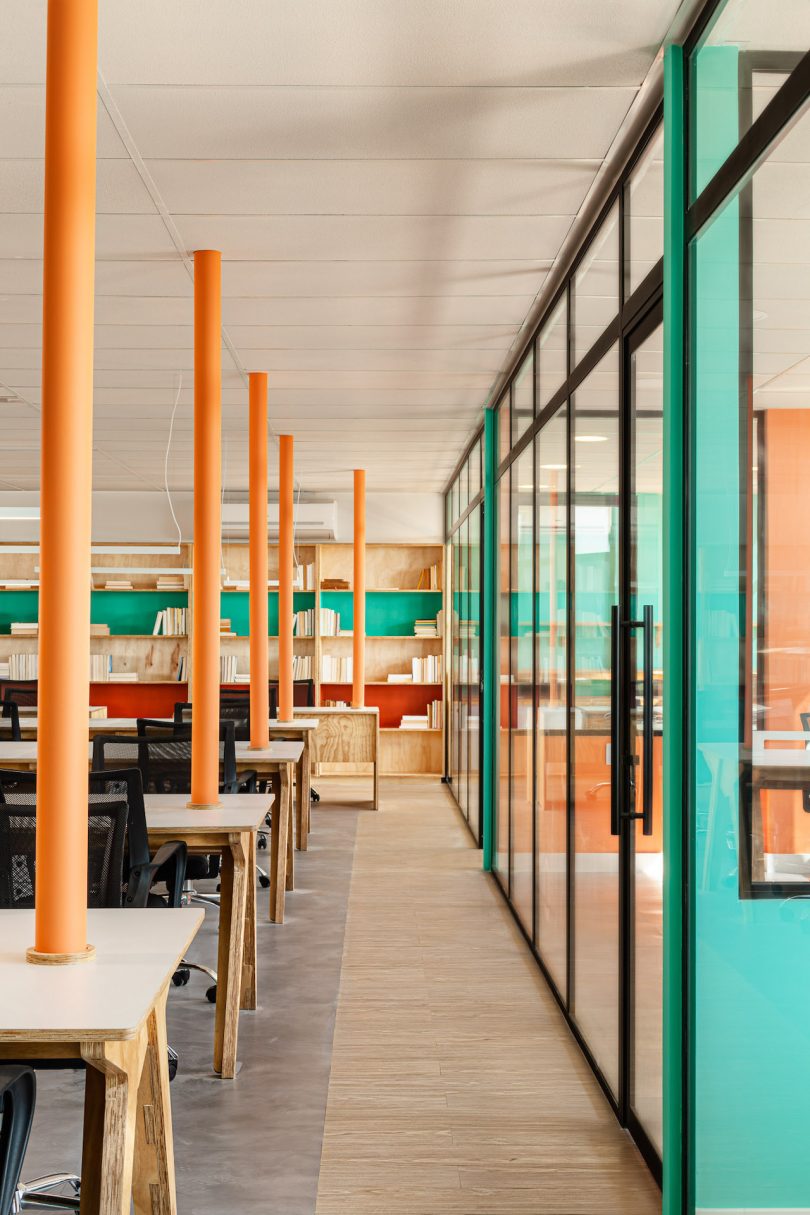
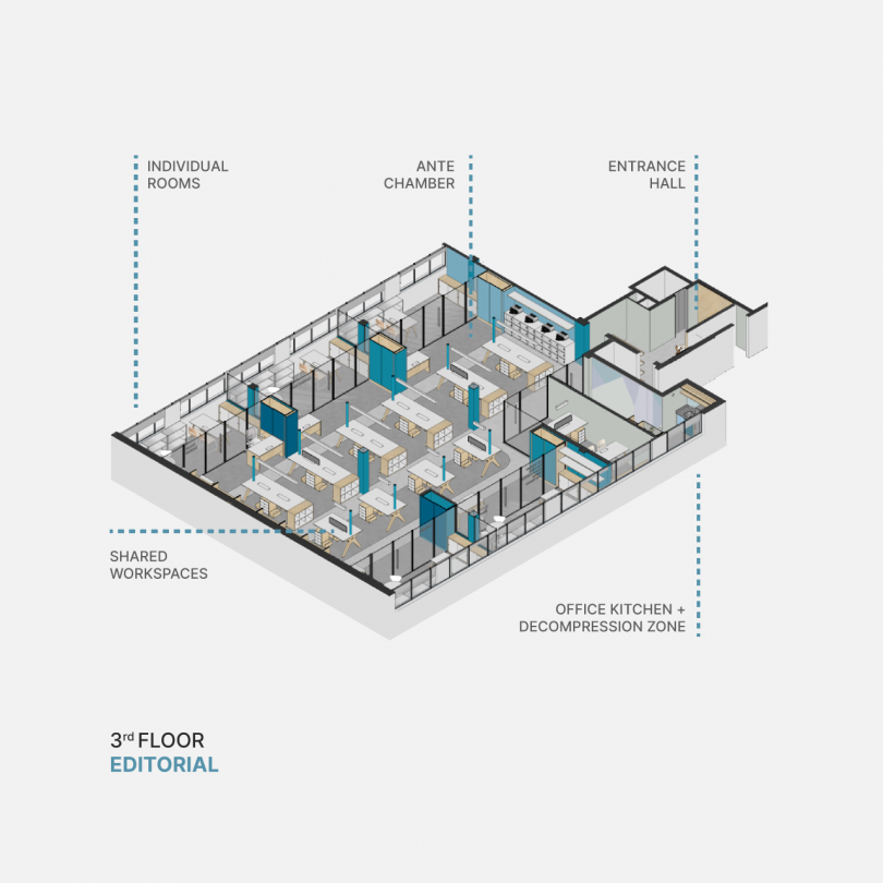
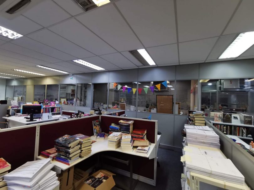
The old office had outdated layouts, furniture and aesthetics made worse by the fluorescent lighting. Publishers were spatially separated by different groups of books, all on one floor. STUDIO DLUX decided to renovate and restructure two floors in the building to separate the different sectors of the company. The third floor, with its shades of blue, would be used by the editorial team. Workstations spread across the middle of the floor allow for better collaboration, while the private rooms along the edges of the floor can facilitate more strategic meetings.
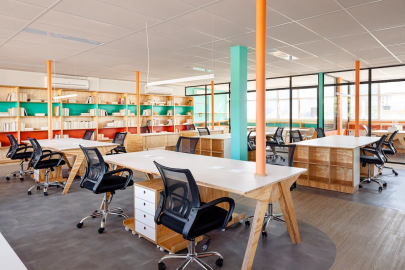
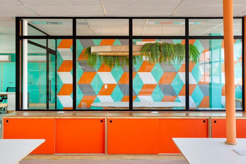
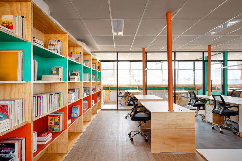
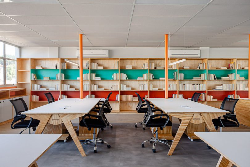
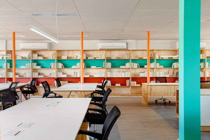
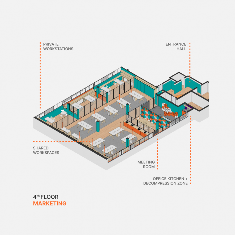
The fourth floor was dedicated to the marketing team and has a more open layout and meeting rooms for marketing activities. The orange and turquoise color scheme was chosen by the team to make the space lighter and brighter.
BEFORE:
Photos by Dhani Borges.
from WordPress https://connorrenwickblog.wordpress.com/2021/08/18/a-publishing-house-in-brazil-uses-color-to-split-the-office/




No comments:
Post a Comment